
Five Pre-flight Checks for Your Dashboard
So you’ve built your data pipeline, you’ve designed your dashboard and you’ve connected the two through a real app. The screenshots match the designs and you can show it off and wow the stakeholders. Ready to launch, right? Well, maybe. In this post we’ll cover five things that are easy to overlook: some worth a quick check, some you might not have thought to add.
Sample Dashboard
Before we dive into those five things, however, I’ll introduce the sample dashboard. It uses data from the {nycflights13} R package developed by Hadley Wickham but is otherwise built entirely without R. Instead it’s built using standard frontend web technologies: HTML, CSS and JavaScript, with data coming from a single monolithic gzipped JSON file. The JavaScript then adds some noise to the data, so it looks more like live data (and so the dashboard doesn’t appear blessed with 20/20 foresight).
The actual visual presentation is that of online departure boards for the three New York/New Jersey airports — John F. Kennedy Intl, La Guardia and Newark Liberty Intl — along with some weather information and some assumed KPIs.
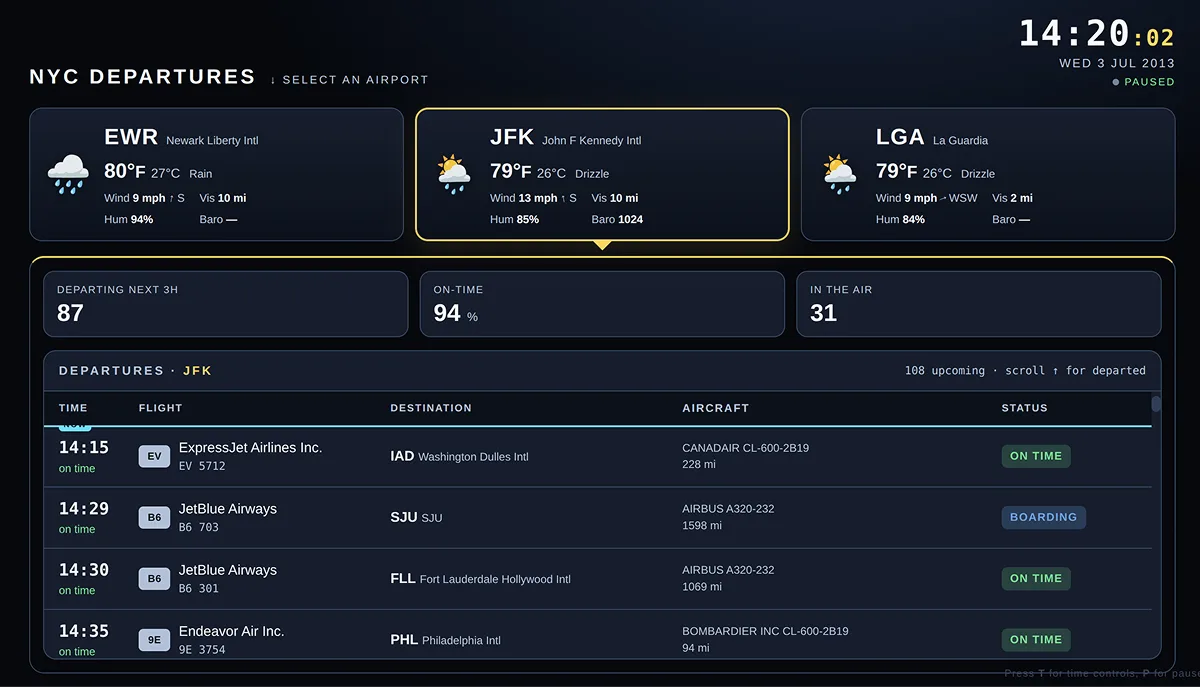
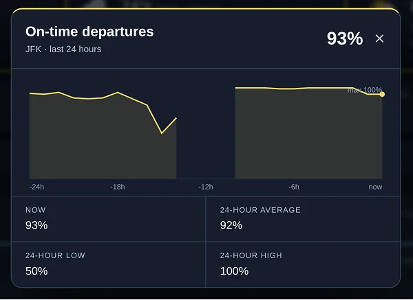
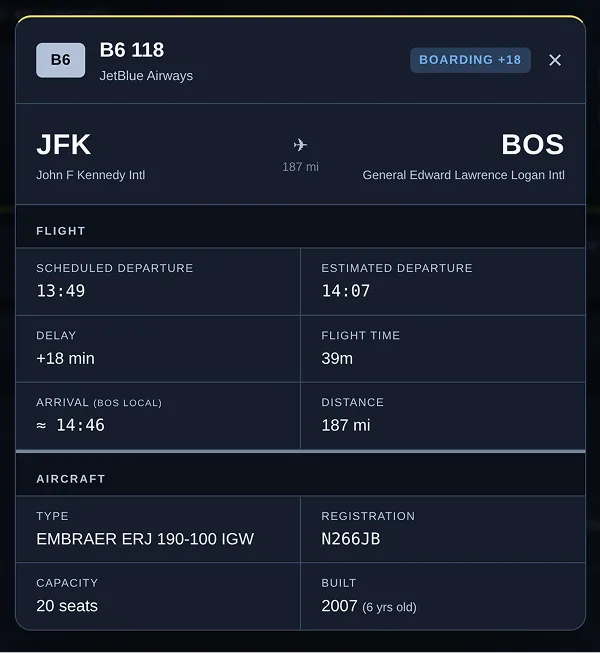
Each table row and each KPI card is clickable, bringing up a modal with more detailed information. Please note that, spoiler alert, the dashboard does not (yet) function well on mobile. We will get to that shortly.
Full disclosure: for rapid prototyping, the dashboard was built through an extended prompting session with Claude Code. Most of the issues I’ll cover are genuine problems that came up in the session, but in one case I did ask Claude to leave out a feature it clearly wanted to add, purely for illustrative purposes. This example, in the state it’s in, is meant to represent a dashboard that an intelligence — human, artificial or Martian — might reasonably judge ready to ship. The rest of this post exposes some remaining flaws.
Five Things to Check
Does the design work at different screen dimensions?
This is the easiest one to check and, perhaps, the most important. While dashboards are still primarily built on desktop machines, making them viewable on tablets and mobile phones should be a part of most development plans. Many, probably most (data are inconsistent and highly topic- and region-dependent), humans use mobile devices to consume content on the World Wide Web, and you should have a very good reason for excluding them from your dashboard. It’s not just improvements in mobile hardware pushing people that way; the expansion of fifth-generation mobile network technology (5G) can make the experience much nicer than it used to be, especially when the consumers themselves are mobile.
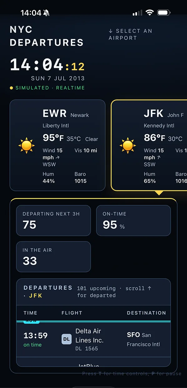
This screenshot of our sample dashboard quickly highlights a big problem with it: it is literally impossible to bring up the data for La Guardia airport because its “button” (it’s not really a button, which is another issue we’ll come on to later) is off the right side of the page, with no possibility of scrolling to it.
Less critical, but still worth fixing, is the two-way scrolling of the table. This is avoidable by stacking table columns on narrow screens. Both of these fixes are shown in the next screenshot. (The content is much taller now so we show the full page, not just the visible part. On my phone, for example, the top of the table can just be seen without scrolling.)
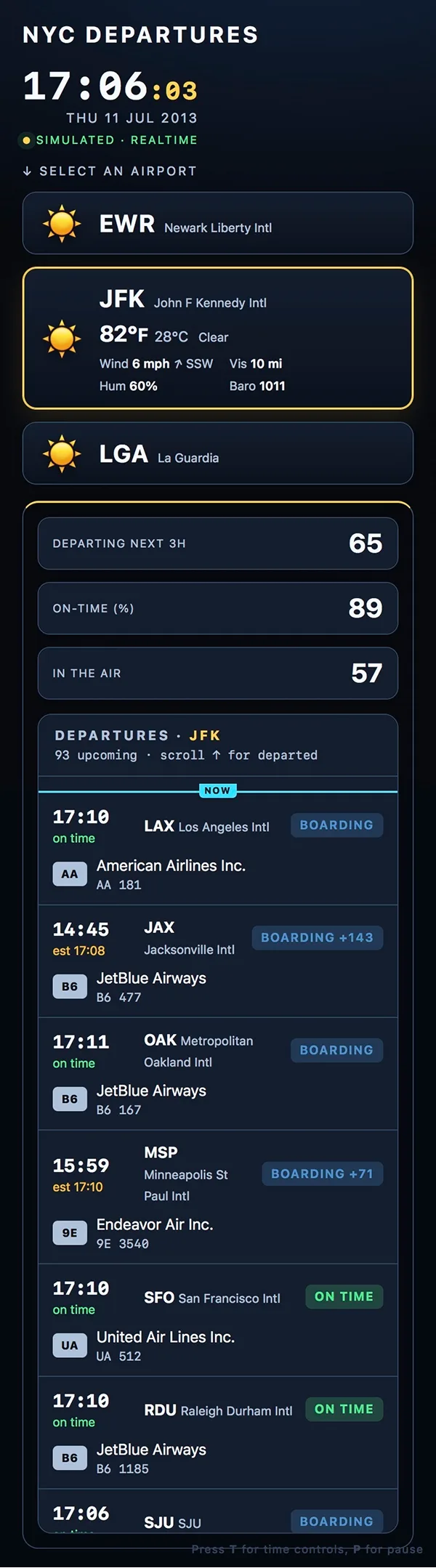
There’s actually a problem with the layout in both dimensions: on a shorter screen — perhaps a small browser window on a cramped notebook — the table can become unreachable. The problem here is that, in designing for (larger) desktop browsers, the design assumed a minimum browser height and then scrolling only on the table and not on the browser window itself. This works well when the browser window is tall enough, since you get fixed information at the top with no nested scrolling. But when this (arbitrary) minimum height condition isn’t met, the design fails. So that’s another thing that should be fixed prior to launch.
Does the app support touchscreens?
Supporting mobiles and tablets isn’t just about layout. Interactions need to work when the input comes from a finger or stylus rather than a mouse and keyboard. There are actually two things to consider here:
- Can all interactions be done through touch?
- Is it obvious what interactions are actually possible?
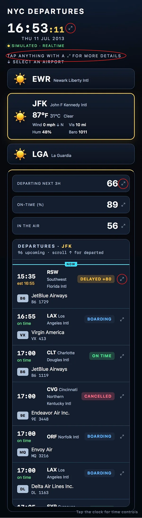
The base app allows the user to “change time” through a dialog that only opens when pressing the T key. This, obviously, fails 1). We can fix it by making the clock itself into a tappable object that brings up the same dialog as pressing the T key (this also gives the user access to the pause option that was previously only possible by pressing the P key). This brings us neatly on to 2): it’s not inherently obvious that the clock is tappable. Nor is it obvious that the cards and rows can be tapped for detailed information. With a mouse at least, these change colour (slightly) when hovered over. We need something more: we can go with a common icon and some explanatory text.
Is the app accessible?
Beyond use on mobile, there are a number of additional accessibility issues with the base version of the app. At least three of these relate to keyboard usage:
- Button-like interactive elements are not HTML
buttonelements and therefore don’t have appropriate interactions and semantics to meet WCAG requirements; - Not everything that can be clicked/tapped can be interacted with by a keyboard user;
- The modal that appears when selecting interactive elements does not implement focus trapping, meaning a keyboard user can lose focus somewhere in the background behind the modal window.
We can fix all these issues with better use of HTML elements: buttons for airport selection, KPI-modal launch, and flight modal launch, and the dialog element for the modal windows. On top of this, some text in the base app does not meet colour-contrast requirements, so we also want to fix this.
The keyboard focus indicator uses the yellow accent colour found elsewhere in the app. In hindsight this was probably a mistake. A different colour focus indicator would make it clearer what had keyboard focus as opposed to what had actually been selected (i.e. which airport was currently being shown).
Is the app performant?
The app is meant to simulate real data but allows the user to select, pause and speed up time. Consequently, the data isn’t passed around in the format it would be if it were a real app tracking live events. But we can still try to optimise how we pass around data in our simulated-data app. The biggest win we found here was converting the data from row-based to column-based. This reduced the size of the data (gzipped) by a third, from 4.8 MB to 3.2 MB, and JSON parsing times from ~550 ms to ~250 ms.
It is, of course, important not to waste time and resources on premature and unnecessary optimisations. So consider the data change above as an example of where one might want to look rather than a change that was strictly necessary.
Another place to look is at the size of images. For dashboards that often means data visualisation. Large, frequently changing raster images sent from the server can lead to performance hits. This is what you get, by default, in Shiny apps when you use renderPlot()/plotOutput(). Packages that render SVG or HTML canvas directly in the browser can greatly reduce the overhead.
Does the app feel like it responds immediately to interaction?
Actual performance is one thing, but perceived performance can also be significant. If a user clicks on a button and nothing happens for a second or two, things “feel” broken even if, in reality, the browser is just processing things silently in the background. In our particular case, there is a simulated delay of ~2 seconds when changing airport. Click or tap on an airport and nothing happens. (Disclosure: this is where I actually had to force Claude not to put something in in order to make my point.) There are a number of options here for how to deal with this. The simplest might be to set the cursor to a value of “wait” in CSS, but this would obviously not help users of touchscreen devices that lack a cursor. A better alternative is to show a loading indicator to everyone. These typically rotate, so we could use an animated GIF or a static image file and CSS animations.
For longer waits, a progress indicator would be a better option if it were possible to actually estimate progress. This would ensure it didn’t look like the page had got stuck. For a wait of a second or two, this is not necessary; the requirement is only that the user sees that their action of clicking on an airport had an effect immediately.
Summary
You can see all the fixes discussed in this post (and some more we had to skip over for brevity) in the final version of the dashboard. Hopefully this article has illustrated that there can be quite a few issues with a newly designed dashboard that may be subtle or hidden, particularly if you’re only testing with a mouse on a desktop computer. The goal here wasn’t to scare you away from publishing entirely, so hopefully I haven’t done that, but to highlight that the devices via which a dashboard is developed and consumed are often quite different: remember to design for the latter. Similarly, just because you know something works and will load eventually does not mean you can expect your users to be as patient and forgiving.