Getting started with Tableau

What is Tableau?
Tableau is a software company specialising in interactive data visualisations, and Tableau Public is a free platform they offer for sharing insights into data via visualisations. It is intended solely for public data, meaning insights are for anybody to see. They also offer Tableau Server, which is specifically for commercial use with private data.
Why use Tableau?
Tableau is a great option that sits between Excel-like software and using a programming language such as R or Python. Tableau Public is highly intuitive for new users; it’s easy to get started and makes analysing data more accessible. For instance, you can manipulate data and join datasets with ease, with no coding involved. There’s a big community aspect to Tableau, with many interesting visualisations featured on the home page to inspire, spread knowledge and give recognition.
What can you create with Tableau?
Before we get into how to use this software we’d like to showcase two items we found on the homepage which show what is achievable with Tableau Public. First is an aesthetic report based on some 2022 data by Elaine Siu exploring the quality of life within cities. The next one is an interesting visualisation by David Potter in which he analyses the rating of remade films versus the originals.
First steps
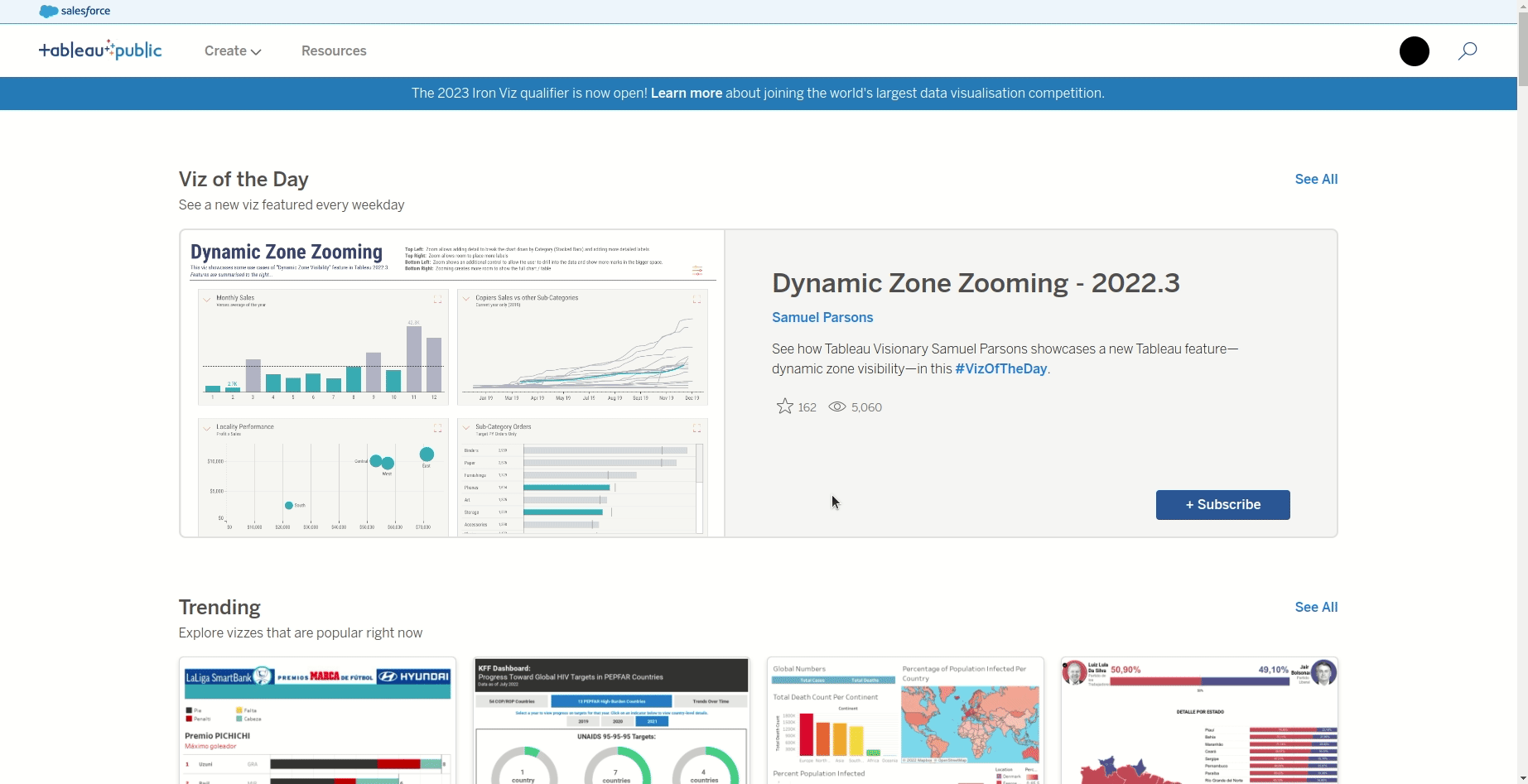
The first step is heading to the Tableau Public website and signing up for an account. It is also possible to use Tableau Public on desktop but today we are covering how to use it on the website. This simply requires an email address and password. Once logged in, you will be taken to the home page where you will see the “Viz of the day” and other featured visualisations.
Creating a workbook
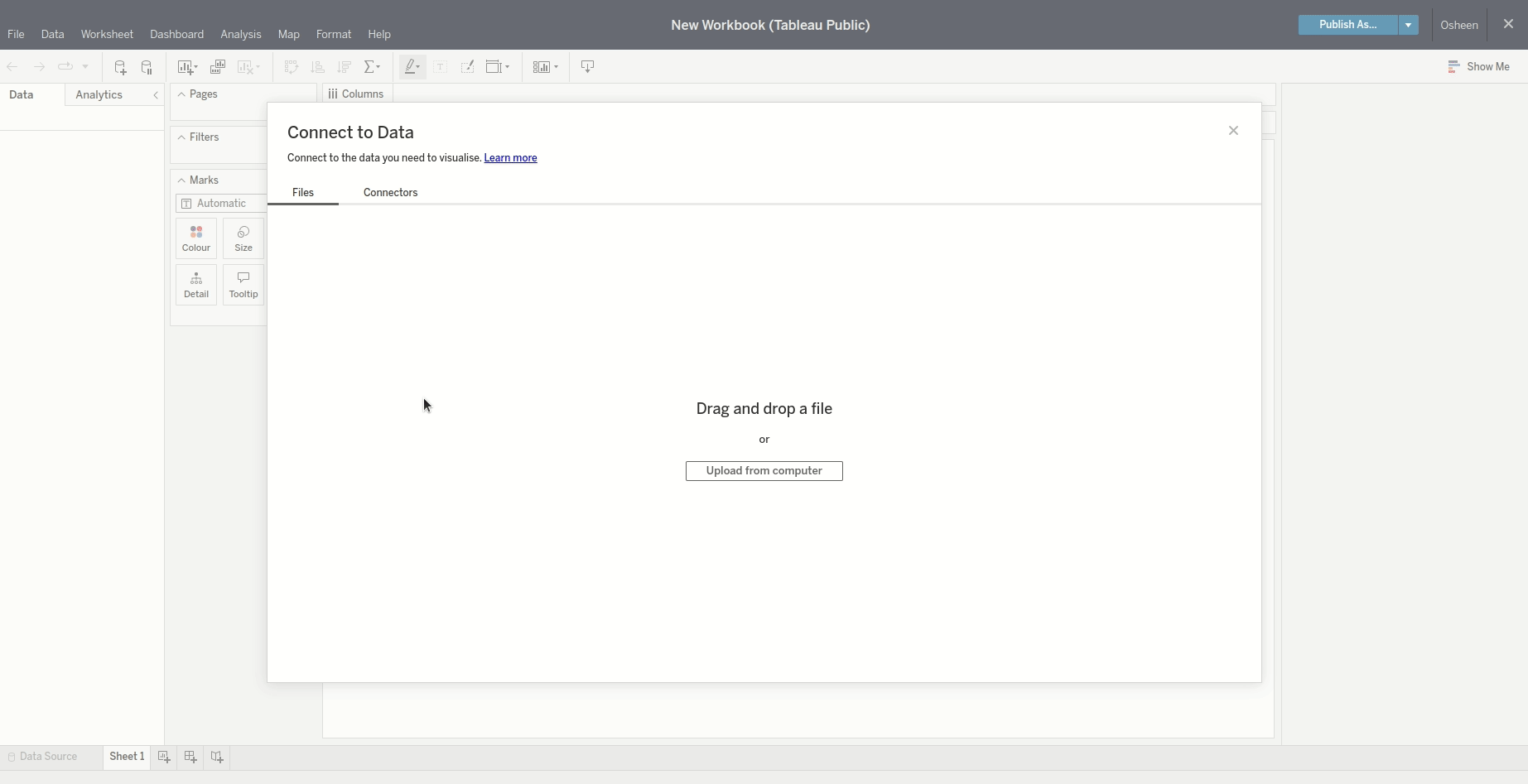
From the home page, hover over the create button at the top left of the screen and then click web authoring. This will create a workbook for you, from which you can upload data and start creating visualisations. To save your work at any point, click “Publish” in the top right corner. The work will become publicly available on your profile, however, if you don’t want the work to appear on your profile you can change it in the settings.
Uploading your data
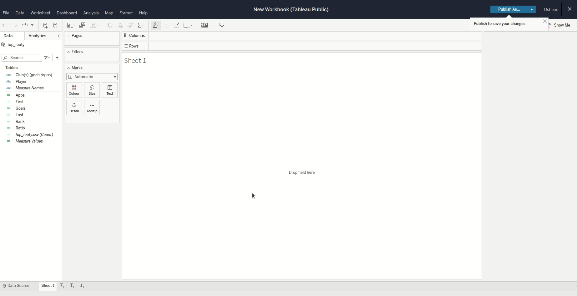
Uploading data is easy - either drag and drop a file or hit upload from your computer. Tableau accepts many different formats including CSV, MS Excel and Google Sheets. For this example I am using a small data set containing the top premier league goal scorers from Wikipedia. Tableau will then sort the variables in your data into discrete and continuous data types (you can change this later as you please).
First visualisation
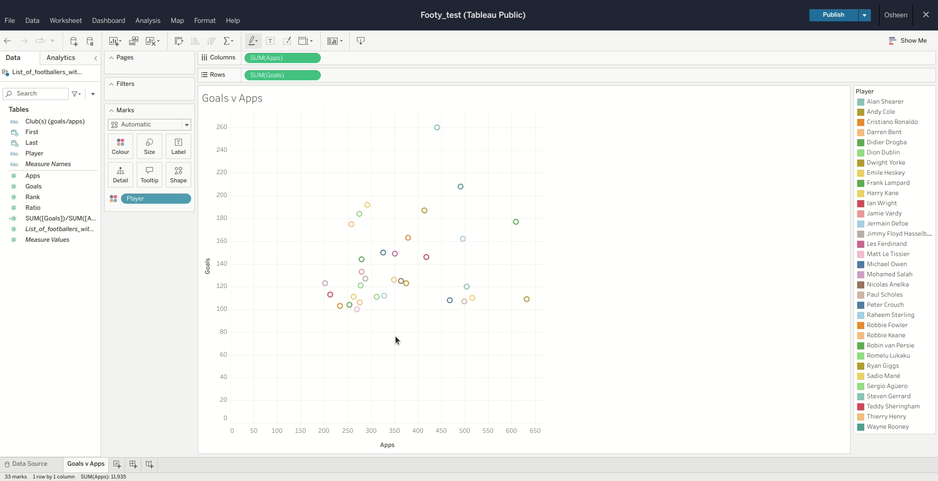
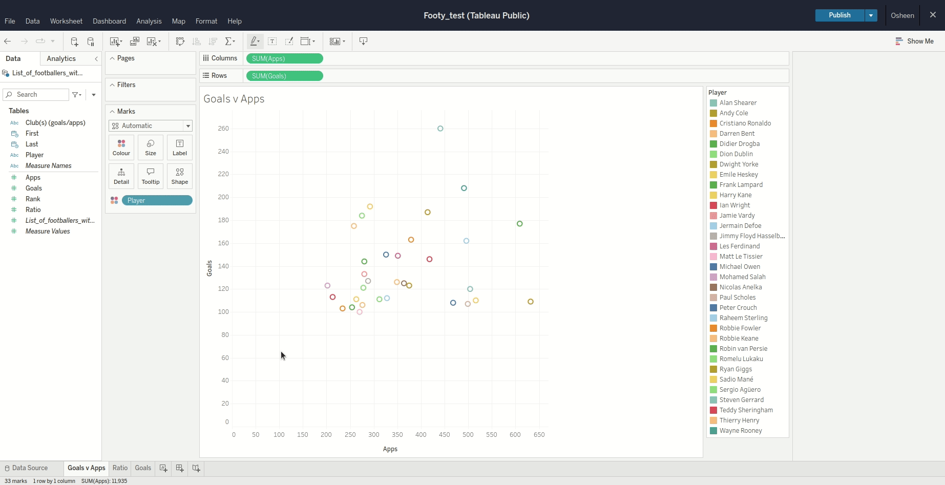
Once the data is uploaded you want to click onto “Sheet 1” in the bottom left hand corner, this will take you to the first sheet in your workbook. From here you will see all the variables from your data in the data pane to the left of your screen. Just drag and drop the variables you want to visualise into the columns and rows boxes at the top. We are going to plot goals by appearances from our data then colour by player name by dragging the Player variable to the colour box.
New worksheet
Once happy with your plot (don’t worry, you’ll still be able to update it), you may want to change it’s name from “Sheet1” to something more descriptive as it will make things easier going forward. Double click the tab that reads “Sheet1” and type a new name. We’ll call ours “Goals by Apps”. Then to create a new worksheet just click the button next to your first sheet.
Creating a dashboard
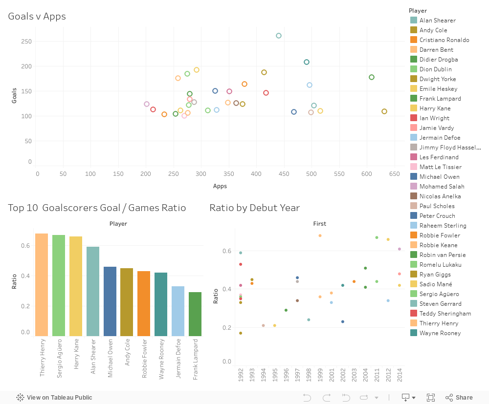
Finally, to create a dashboard you just have to click “New Dashboard”. This is found at the bottom next to the sheet names. Once you have the dashboard, drag and drop your sheets from the left hand pane into the configuration you want. In our example, we’ve created two more visualisations for the dashboard, which are a bar chart showing the goals to game ratio for the top ten goalscorers and a scatter plot of players goal to game ratio by their debut year. If you update any of the plots in the worksheet the dashboard will update accordingly.
Our dashboard
One of the great things about Tableau dashboards is the fact that you can embed them on a web page very easily. If you want to share a dashboard you can either grab the link or grab the embed code and insert it into your website. Our embedded dashboard is below and as you can see it retains interactivity and will update if we change anything on Tableau!
What next?
The next step is for you to get on Tableau and have a go yourself! Try uploading some data and seeing what kinda of visualisation or dashboard you can make. If you don’t fancy having a go, you could visit the website and have a look at some of the featured dashboards.