Optimising tooltip design with modern CSS
In my blog post on improving the responsiveness of Shiny applications I mentioned a recent project I was involved with as part of a collaboration with Utah Tech University. Part of that project involved the construction of interactive Sankey (or to be extra-precise “alluvial”) diagrams using the d3 JavaScript library. One of the requirements was that the user could hover over a link or node in the diagram and see all the connections to or from that link or node highlighted. The image below shows a cropped section of one such Sankey, constructed using data from the diamonds dataset in R’s {ggplot2} package. The data used was handy for illustrative purposes here - whether a Sankey diagram is a good way of visualising that data is largely moot for the discussion that follows.

While colour-highlighting can be a great way of emphasizing part or parts of a chart or diagram, it doesn’t usually add precise information, which was important to the client. To add this precise information we used a tooltip. But to make them as effective as possible we had to spend a bit of time refining their design.
The power of tooltips
Tooltips typically give you precise information next to your cursor or where you’ve just tapped. That is to say, where you happen to be looking. This is great because, to put it bluntly, your peripheral vision is rubbish. Don’t worry, mine is too. As Jeff Johnson outlines in Designing with the Mind in Mind) (third edition, chapter 5), the centre of our visual field - the fovea - contains around 158,000 cone cells per square millimetre and around half of the visual cortex is then devoted to processing information coming from the fovea. Yet the fovea makes up only about 1% of the retina! The rest of the retina contains only around 9,000 cones per square millimetre and, on top of that, data from these cells is compressed (multiple cones and rods connect to each ganglion cell) before being sent to the brain.
Peripheral vision is useful for detecting motion. That’s great if you want to see that apex predator sneaking up on you or that application in your MacOS Dock that really wants you to give it some attention (thanks Apple! 🙄). So peripheral vision guides attention. By using tooltips close to your cursor you don’t have to worry about your user’s focus and attention having to dart from one bit of the screen to another (and maybe getting lost on the outward or return journey).
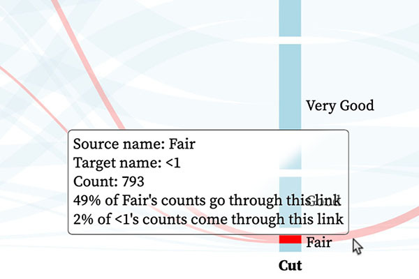
Returning to our Sankey diagram, by adding a tooltip relating to the item being hovered over we can see precise information relating to that item - “details on demand”.

The problem with tooltips
There’s a problem. And that problem is the same as the advantage given before: the tooltip is placed right where you happen to be looking. This is bad because there’s a reasonable chance some useful information has just been occluded. If we compare the two images above we can see that, in the latter case, the “Good” node has been completely hidden while the vertical extents of the “Very Good” and “Fair” nodes are also no longer obvious. With a tooltip that follows the cursor, the user can move around a bit, but it’s not ideal, especially with the thinner links.
One obvious option is to make the background translucent. With an HTML tooltip we can do that by setting its CSS background-color property to a colour with an alpha channel value less than one. Let’s try rgba(255, 255, 255, 0.3):
This does a pretty good job of fixing the occlusion problem but now the text on the diagram interferes with the text of the tooltip, making them both hard to read where they overlap. One could conceivably hide the Sankey text when the tooltip is visible, but that is likely to lead to an annoying flashing behaviour as that text comes and goes with cursor movement.
Combatting occlusion without introducing intereference
Now, chances are you’ve sat through a few video conferences over the last few years. If you have, there’s a high chance you’ve seen the use of blurring background filters - the application detects what, in the video feed, is the human and what is the background and blurs the latter. The viewer of the feed then sees the human clearly while the background is much less clear. There’s still a general feeling for what’s there but not the details. You might be able to make out that there’s a bookshelf with books and trinkets but not the titles of the books or the precise nature of the trinkets.
This got me wondering whether I could do something similar for tooltips. I already knew there was a CSS filter property with a blur() function so I thought I’d try that:
Oops. That did not improve readability at all. Obviously I don’t want to blur the text in the tooltip. So my next thought was to make the text container transparent then place a separate, translucent, background element directly behind it and apply the blur filter to that. Thankfully I didn’t have to go to that faff as I discovered there also exists a backdrop-filter property. The interactive graphic below shows it in action, with the updating CSS below showing what might be used with a tooltip that has an HTML class of "tooltip". (Note that in this example the blur is measured in pixels and the image size varies with screen width, so the optimal blur size here may vary for you depending on the dimensions of your browser window.)
  .tooltip {
    background-color: rgba(255, 255, 255, 0.3);
    backdrop-filter: blur(2px);
  }
This does exactly what I want: The text of the tooltip is completely readable (for me at least, more on that in the Q & A section below). The “Good” node is still visible as a distinct entity from the “Fair” and “Very Good” nodes. Ok, I can’t read the label any more, but I at least know there is something of interest there.
What is actually happening? The CSS blur function applies a Gaussian blur to the target element’s background with the standard deviation specified as the argument (e.g. two pixels). Large areas of flat colour are only really affected at the edges - in entirely non-scientific terms I like to think of it as some of the colour from one pixel being smudged into neighbouring and nearby pixels while the nearby pixels smudge the same colour back into the original pixel for no net effect. Text is basically all edges and so is completely smudged - black text on a white background becoming a grey “blob”.
A more scientific explanation would probably include talk of Fourier transforms, the frequency domain and low-pass filters.
Q and A
Does this work on all browsers?
The backdrop-filter property does not work on Safari at the time of writing, it’s simply ignored. However, there is a vendor-prefixed version - -webkit-backdrop-filter - that does work. So a little update to the CSS code (that I already sneaked in behind the scenes to the example above) can make this work across all modern browsers (as far as I’m aware):
.tooltip {
  background-color: rgba(255, 255, 255, 0.3);
  -webkit-backdrop-filter: blur(2px);
  backdrop-filter: blur(2px);
}
What about accessibility?
While we like to cover accessibility issues in our blog posts, a thorough treatment of tooltip accessibility is beyond the scope of this post. However, it is worth mentioning that some people may struggle with the reduced contrast that can come with a translucent tooltip background. So it might be worth considering offering users an override to make the background opaque. Alternatively, your CSS code can check if your user has informed their operating system or browser that they prefer increased contrast. When they do, you then override the applied styles:
.tooltip {
  background-color: rgba(255, 255, 255, 0.3);
  -webkit-backdrop-filter: blur(2px);
  backdrop-filter: blur(2px);
}

@media (prefers-contrast: more) {
  .tooltip {
    background-color: white;
    -webkit-backdrop-filter: none;
    backdrop-filter: none;
  }
}
Will this solve all my tooltip occlusion issues?
Probably not. It works here because the encodings I want to keep visible are large blocks of colour and those I want “obscured” are smaller. Because of this, I’m guessing this design style might work effectively with some thematic maps. On the other hand, where the data is encoded using small elements (e.g. a scatter plot with lots of small points of varying colour) the result might not be ideal.