R from the turn of the century
Last week I spent some time reminiscing about my PhD and looking through some old R code. This trip down memory lane led to some of my old R scripts that amazingly still run. My R scripts were fairly simple and just created a few graphs. However now that I’ve been programming in R for a while, with hindsight (and also things have changed), my original R code could be improved.
I wrote this code around April 2000. To put this into perspective,
- R mailing list was started in 1997
- R version 1.0 was released in Feb 29, 2000
- The initial release of Git was in 2005
- Twitter started in 2006
- StackOverflow was launched in 2008
Basically, sharing code and getting help was much more tricky than today - so cut me some slack!
The Original Code
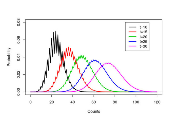
My original code was fairly simple - a collection of scan() commands with some plot() and lines() function calls.
## Bad code, don't copy!
## Seriously, don't copy
par(cex=2)
a<-scan("data/time10.out",list(x=0))
c<-seq(0,120)
plot(c,a$x,type='l',xlab="Counts",ylim=c(0,0.08),ylab="Probability",lwd=2.5)
a<-scan("data/time15.out",list(x=0))
lines(c,a$x,col=2,lwd=2.5)
a<-scan("data/time20.out",list(x=0))
lines(c,a$x,col=3,lwd=2.5)
a<-scan("data/time25.out",list(x=0))
lines(c,a$x,col=4,lwd=2.5)
a<-scan("data/time30.out",list(x=0))
lines(c,a$x,col=6,lwd=2.5)
abline(h=0)
legend(90,0.08,lty=c(1,1,1,1,1),lwd=2.5,col=c(1,2,3,4,6), c("t=10","t=15","t=20","t=25","t=30"))
The resulting graph ended up in my thesis and a black and white version in a resulting paper. Notice that it took over eight years to get published! A combination of focusing on my thesis, very long review times (over a year) and that we sent the paper via snail mail to journals.

How I should have written the code
Within the code, there are a number of obvious improvements that could be made.
- In 2000, it appears that I didn’t really see the need for formatting code. A few spaces around assignment arrows would be nice.
- I could have been cleverer with my
par()settings. See our recent blog post on styling base graphics. - My file extensions for the data sets weren’t great. For some reason, I used
.outinstead of.csv. - I used
scan()to read in the data. It would be much nicer usingread.csv(). - My variable names could be more informative, for example, avoiding
canda - Generating some of the vectors could be more succinct. For example
rep.int(1, 5) # instead of
c(1, 1, 1, 1, 1)
and
0:120 # instead of
seq(0, 120)
Overall, other than my use of scan(), the actual code would be remarkably similar.
A tidyverse version
An interesting experiment is how the code structure differs using the {tidyverse}. The first step is to load the necessary packages
library("fs") # Overkill here
library("purrr") # Fancy for loops
library("readr") # Reading in csv files
library("dplyr") # Manipulation of data frames
library("ggplot2") # Plotting
The actual tidyverse inspired code consists of three main section
- Read the data into a single data frame/tibble using
purrr::map_df() - Cleaning up the data frame using
mutate()andrename() - Plotting the data using {ggplot2}
The amount of code is similar in length
dir_ls(path = "data") %>% # list files
  map_df(read_csv, .id = "filename",
         col_names = FALSE) %>% # read & combine files
  mutate(Time = rep(0:120, 5)) %>% # Create Time column
  rename("Counts" = "X1") %>% # Rename column
  ggplot(aes(Time, Counts)) +
  geom_line(aes(colour = filename)) +
  theme_minimal() + # Nicer theme
  scale_colour_viridis_d(labels = paste0("t = ", seq(10, 30, 5)),
                         name = NULL) # Change colours
and gives a similar (but nicer) looking graph.

I lied about my code working
Everyone who uses R knows that there are two assignment operators: <- and =. These operators are (more or less, but not quite) equivalent. However, when R was first created, there was another assignment operator, the underscore _. My original code actually used the _ as the assignment operator, i.e.
a_scan("data/time10.out",list(x=0))
instead of
a<-scan("data/time10.out",list(x=0))
I can’t find when the _ operator was finally removed from R, I seem to recall around 2005.