How to customise the style of your {shinydashboard} Shiny app
Using {shinydashboard} is great for creating dashboard prototypes with a header-sidebar-body layout. You can quickly mock up a professional looking dashboard containing a variety of outputs, including plots and tables.
However, after a while, you’ll probably have had enough of the “50 shades of blue” default theme. Or, you might have been asked to to follow company branding guidelines, so you need to replace the default colours with custom ones.
This blog will take you through three different options when customising a {shinydashboard}. First, we’ll look at using the colour and theme options available in the package. Then, we’ll show you how to use the {fresh} package to be able to use completely custom colour palettes. Finally, we will look at using custom CSS to give you even more control of the overall style of your dashboard.
The {shinydashboard} package
Before we get started with styling our dashboard, let’s do a quick
refresher of what {shinydashboard} is and how to use it.
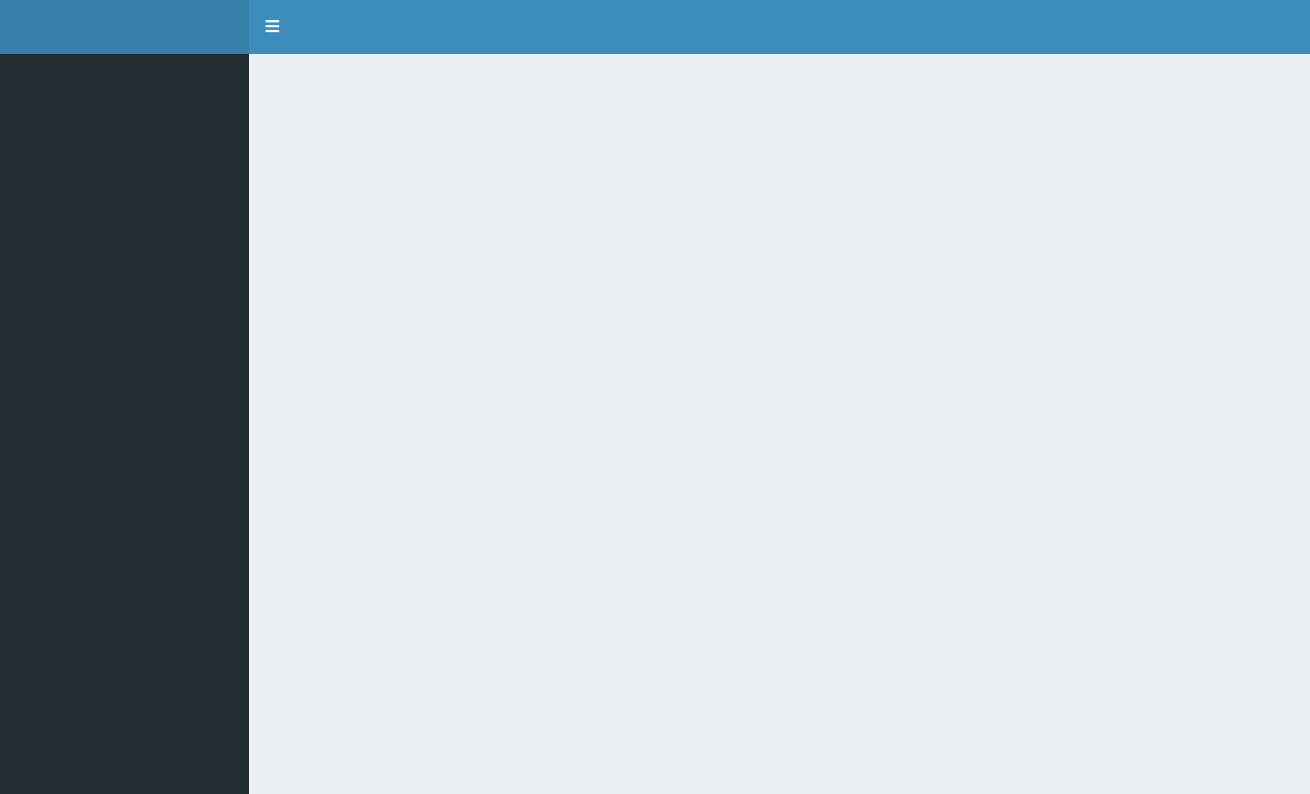
{shinydashboard} is a package which provides a simple dashboard layout
consisting of a header, sidebar, and body. The code below creates an
empty dashboard, using the main layout functions from {shinydashboard}:
dashboardHeader(), dashboardSidebar(), and dashboardBody(), all
wrapped inside of dashboardPage().
library("shinydashboard")
library("shiny")

ui = dashboardPage(
  dashboardHeader(),
  dashboardSidebar(),
  dashboardBody()
)

server = function(input, output, session) {

}

shinyApp(ui, server)
The package is really good at this basic type of layout, and includes
ways to enhance it — for example by adding tabs to your app using the
menuItem() function, as well as the addition of the box(),
infoBox(), and valueBox() functions, offering ways of storing
outputs in different kinds of containers.
Sticking to quite a rigid layout is what makes {shinydashboard} so great - you don’t have to fiddle around with adjusting the width and height of divs, deciding if you want a sidebar and which side the sidebar should be on etc. Instead, you can just use the default layout which is enough for most dashboards.
However, this rigidity is also the main weakness of {shinydashboard}. If you want to move beyond the basic layout, it may require hacky solutions and can sometimes be downright impossible.
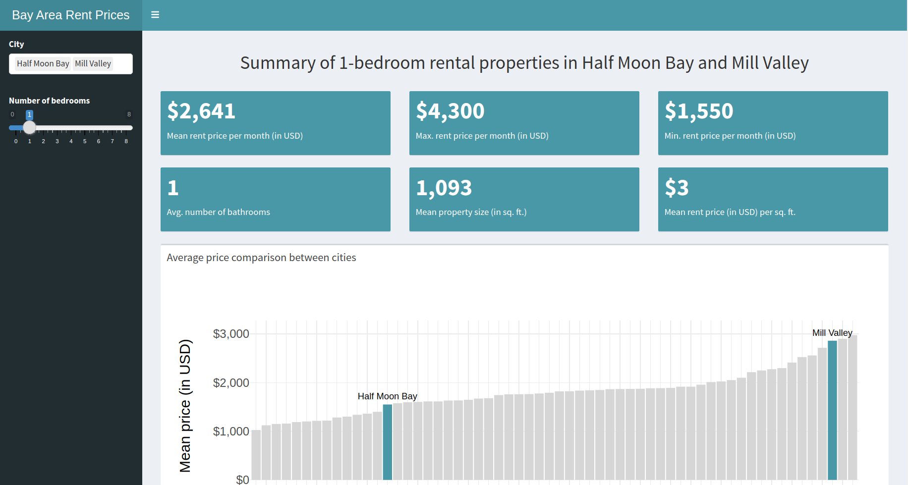
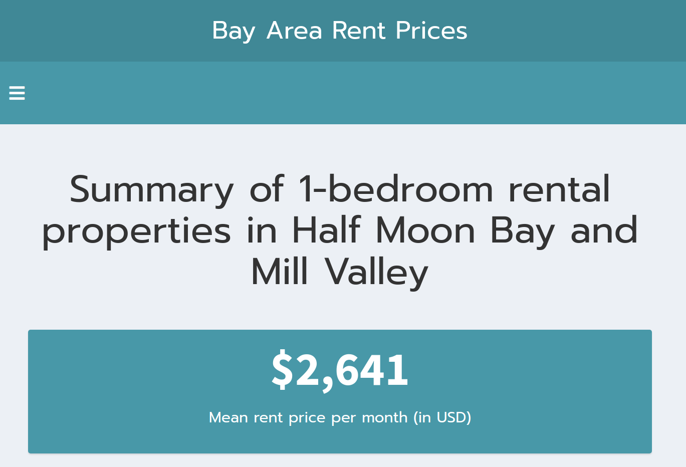
Despite this, it is possible to customise {shinydashboard} using built-in functions and arguments. Let’s take a look at how using an example dashboard which displays and compares some summary statistics for rental properties in the Bay Area of California, US. All code used in this blog post can be found on our GitHub
Using built-in colours and skins
Our example app currently uses the {shinydashboard} default colours. The only styling I have done is set the fill colour of my bar chart to match the colour of the value boxes.
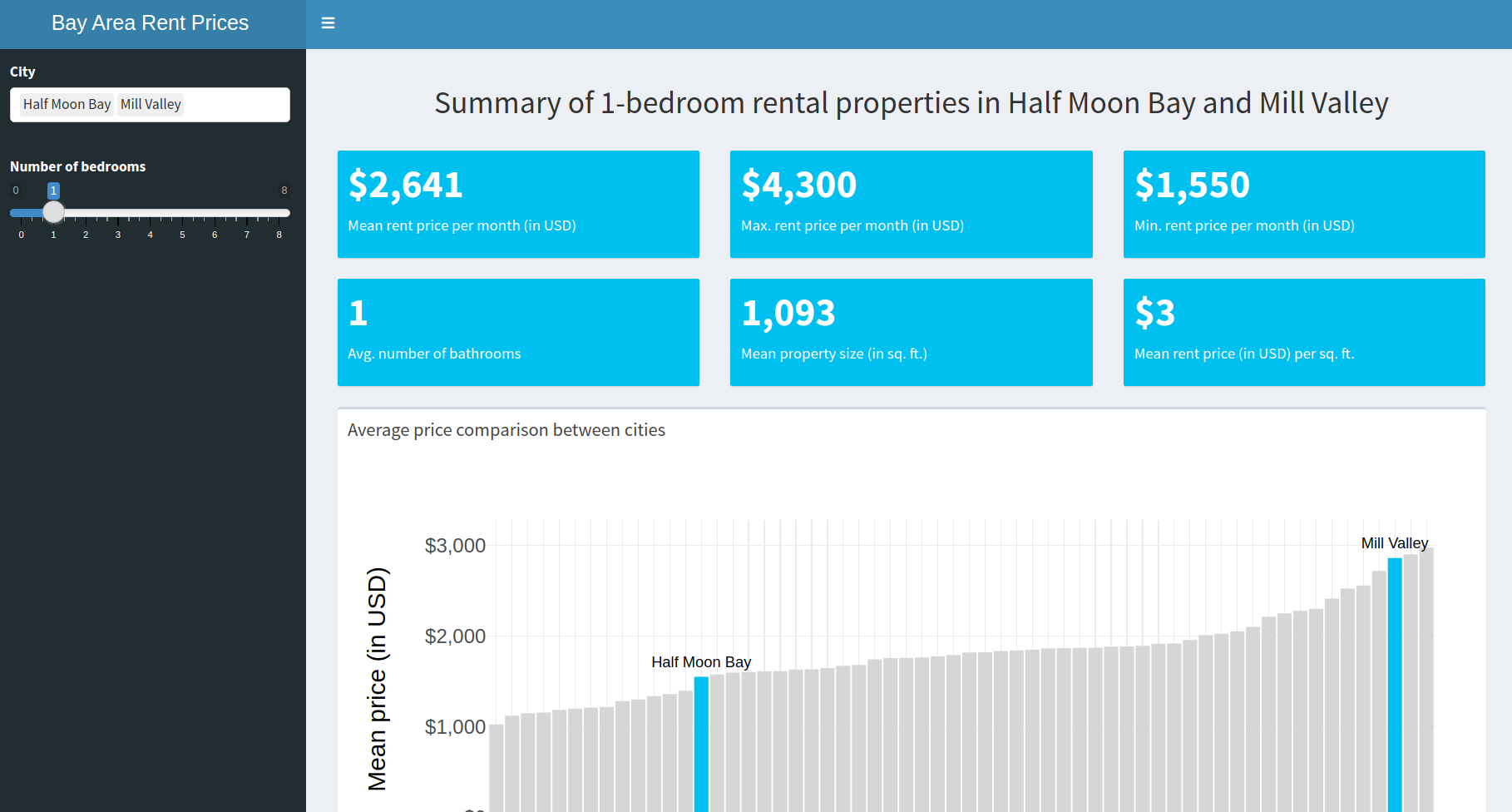
The first thing we can customise is the dashboard “skin”, which is the
colour of the dashboard header at the top of the app. The skin
argument in dashboardPage() can be one of “blue” (the default),
“black”, “purple”, “green”, “red”, or “yellow”. We will set the skin to
be “purple”:
dashboardPage(
  skin = "purple",
  ...
)
which gives us

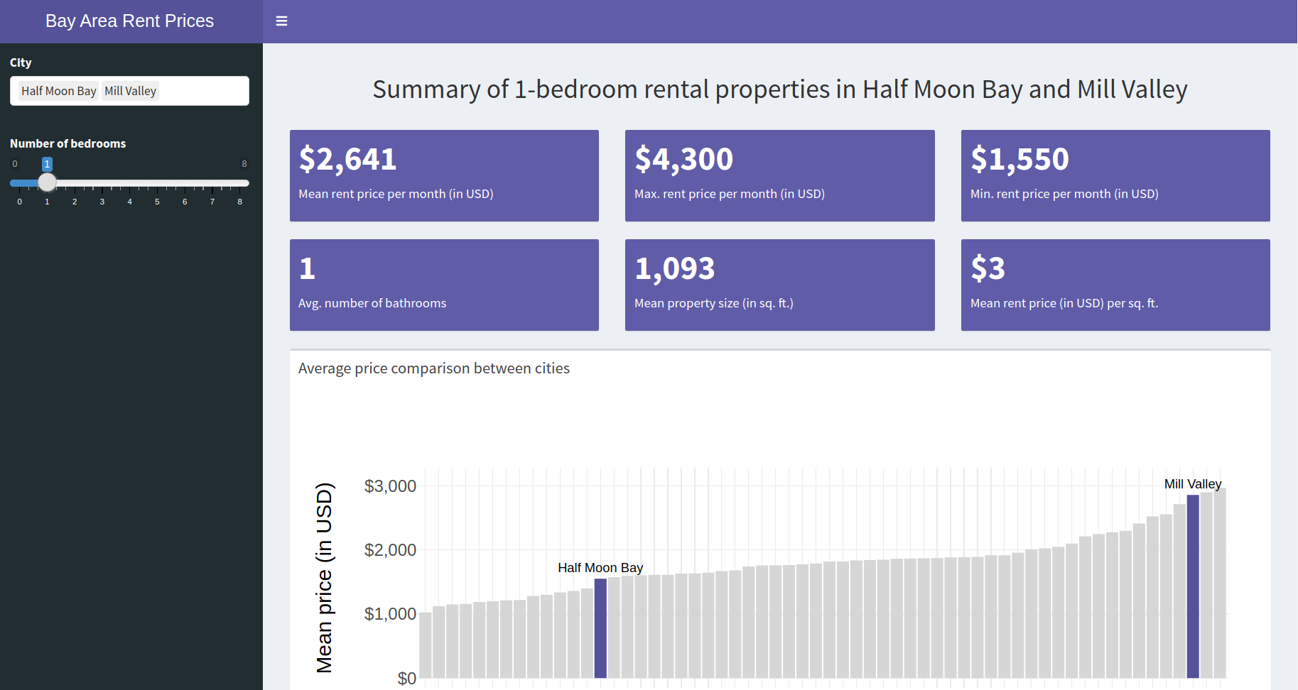
The other main thing we might want to change the colour of is the value
boxes. There is a color argument in the valueBox() function, which
has slightly more colour choices than for the skin (15 instead of 6).
Luckily, there is a purple in the list of valid colours. For all 6 of
the value boxes in the app, we will need to add color = "purple" as an
argument:
valueBox(
  color = "purple",
  ...
)
which gives us:
Using the {fresh} package
The {fresh} package is an add-on package which helps you style your {shiny} apps, including apps built with {shinydashboard}.
{shinydashboard} is built using
AdminLTE, an open source
dashboard and control panel theme built on top of Bootstrap. Therefore,
functions in {fresh} used to customise {shinydashboard} themes follow
the pattern adminlte_*. We will use the adminlte_color() to
customise our default colours.
At the top of our app, we need create a new theme my_theme using the
create_theme() function. In our theme, we are going to change the
default adminLTE colour called “light-blue” to use our company colour
instead:
my_theme = create_theme(
  adminlte_color(
    light_blue = "#4898a8"
  )
)
We then need to tell {shinydashboard} to use this theme, by placing a
call to use_theme() in the dashboard body.
dashboardBody(
  use_theme(my_theme),
  ...
)
Now, if we change our value boxes to have color = 'light-blue', and
remove any skin argument in dashboardPage, we end up with this:
Being able to use any custom colours is definitely a step up from relying on the built-in colour choices of {shinydashboard}. However, let’s take it even one step further and fully customise the look of our {shinydashboard} using CSS.
Using CSS
CSS (Cascading Style Sheets) is the language used to style HTML elements on any webpage. Normally when you build Shiny apps you don’t have to worry about CSS, which is one of the reasons why Shiny is so easy to get started with. But at some point you’re going to want more control of how your Shiny app looks, and then it’s probably time to learn some CSS.
The main way of including CSS in your Shiny app is by creating a CSS
file (a file with the .css extension) and placing it in a folder
called www/ in the same folder where your Shiny app lives. We will
call this file styles.css by convention.
We are going to use this CSS file to modify two things:
- The font of the app: We want to use a custom font
Prompt - The colour of the input slider bar: We want it to match the colour of the rest of the app
Once we have identified the elements and the associated properties we want to modify, our CSS file ends up looking like this:
@import url('https://fonts.googleapis.com/css2?family=Prompt&display=swap');

.irs--shiny .irs-bar, .irs--shiny .irs-single {
  border: #4898a8;
  background: #4898a8;
}

body, h2, .main-header .logo {
  font-family: 'Prompt', sans-serif;
}
The first line imports our custom font called Prompt from Google
Fonts.
The next four lines select the elements of the slider we want to change,
and set the border colour as well as background colour to be our company
colour (#4898a8).
The last four lines select the body text, our H2 heading, as well as the header text in the top left corner and set the font to be our custom font.
Finally, for a {shinydashboard}, you will need to reference the CSS file
in the dashboard body (similar to where we called use_theme() in the
{fresh} example). With a stylesheet called “styles.css”, it would look
like this:
dashboardBody(
  includeCSS("www/styles.css"),
  ...
)
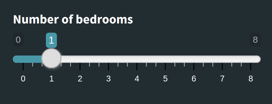
Now our input slider has gone from this:
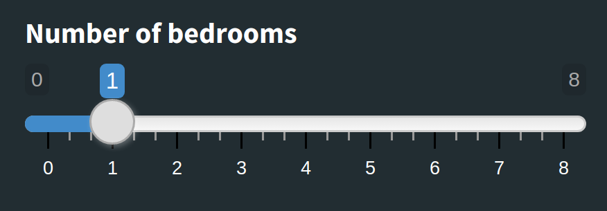
To this:
And our font from this:
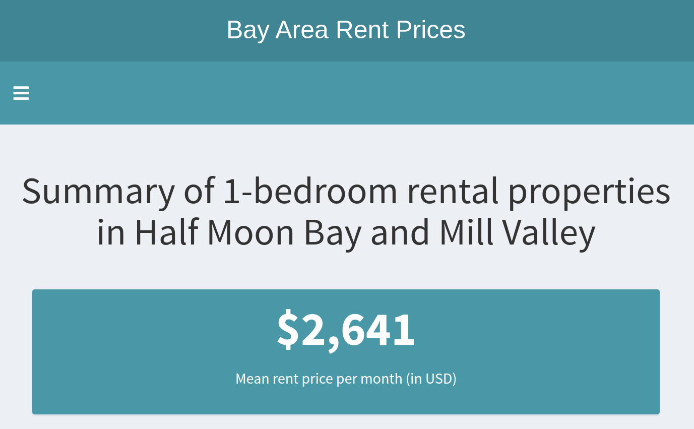
To this:
Conclusion
There are many ways to customise a {shinydashboard} Shiny app. If you are content with a few different colours, you can stick to the default colour palettes, but if you want to use custom colours you should consider using the {fresh} package. If you want full control of the look and feel of your dashboard, you might want to consider learning CSS and creating your own stylesheet! Although, if you wanted to create a very custom-looking dashboard, you might be better off not using {shinydashboard} at all…