Announcing the Jumping Rivers Dashboard Gallery
At Jumping Rivers we love data dashboards and are delighted to announce the release of a gallery to showcase our application-development skills.
Tools like Shiny, Dash, Streamlit and Observable have simplified the process of making interactive, visual, data products.
Despite this simplification, our clients often approach us with challenges that step beyond what is easily achieved in these dashboard frameworks. They may have accessibility requirements, or need applications to be responsive to a users browser size or device. They may need a user interface that matches their branding, or that is easy to use. Data itself is sometimes a challenge, and some clients need a data pipeline developing, for pre-processing or validation, so that their applications can work more effectively. There are niche skills involved in data presentation and visualisation, and we have a wealth of experience with charts, tables, maps and have built a range of custom data-widgets for clients.
Our dashboard gallery contains several applications that highlight our expertise across the Jumping Rivers data science team. Within it, you can find a list of the applications that are available to view, with links to each and some technical information. All the applications are publicly accessible. In the coming months we will be adding further applications to the gallery.
At Jumping Rivers we have worked with Shiny for many years (including Shiny for Python), and have several training courses, dozens of blog posts and host our annual conference “Shiny in Production” on this tool. Consequently, many of the gallery applications are built using Shiny. But our team also boasts expertise with the data visualisation library D3.js and a range of JavaScript frameworks, and so there is a Vue.js application and a timeline developed in D3 presented within the showcase too.
Included in our initial gallery collection are:
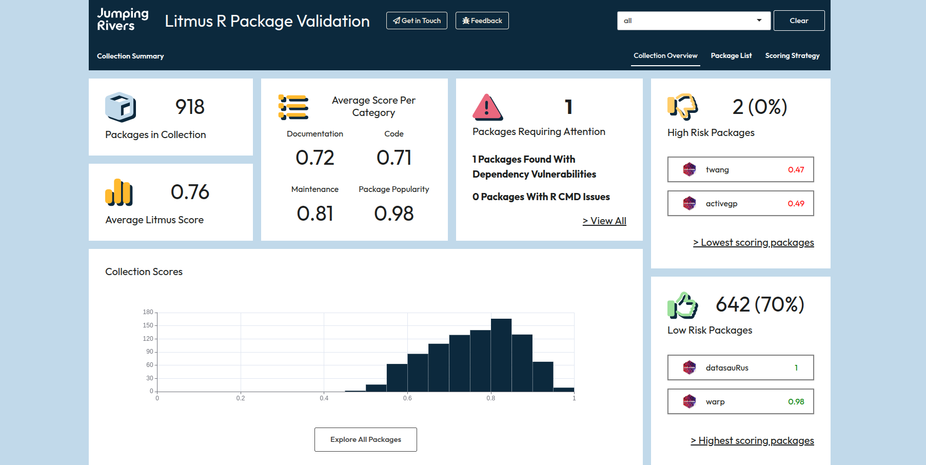
- our Litmus dashboard which displays risk- and quality-scores for use when validating R packages (see our recent blog post);
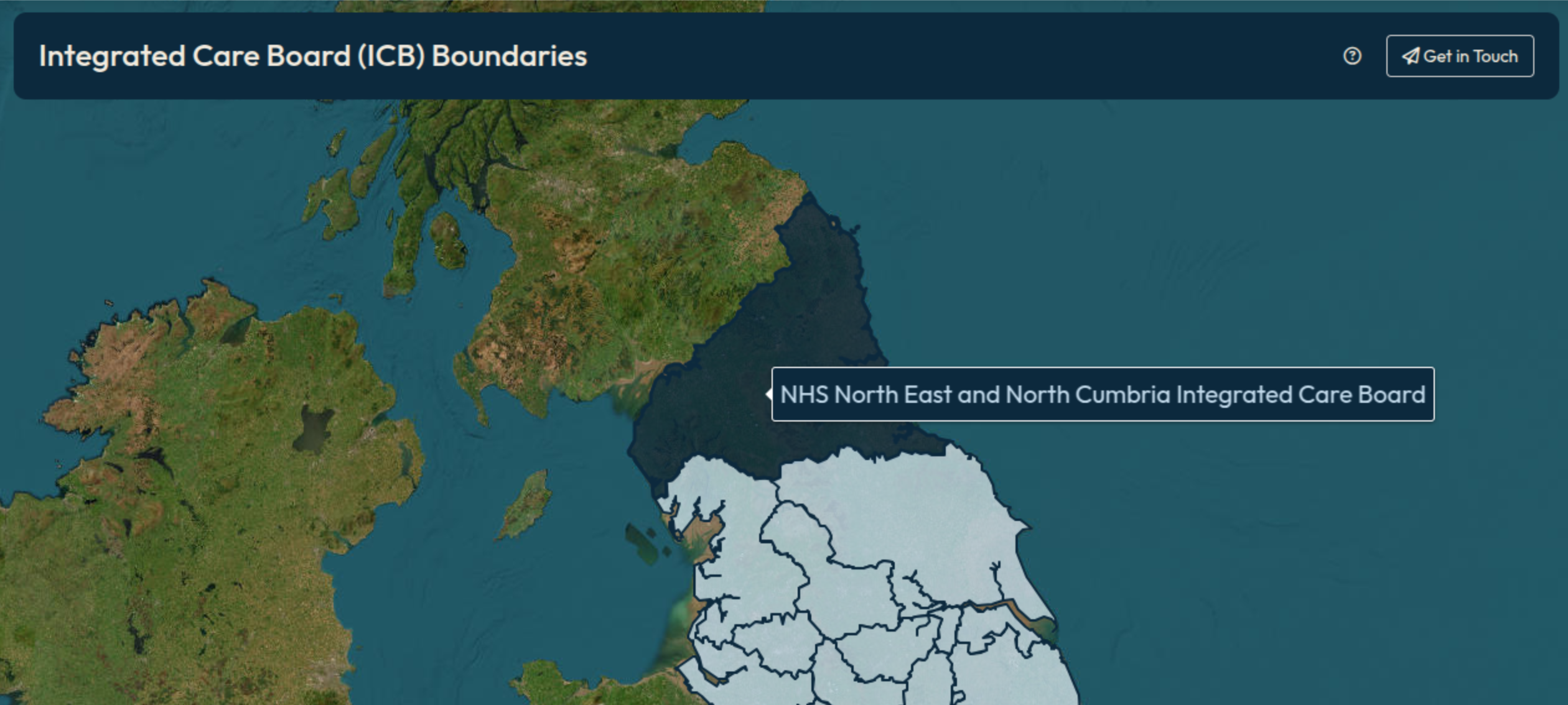
- a map application displaying the “Integrated Care Board” boundaries and population sizes for NHS England;
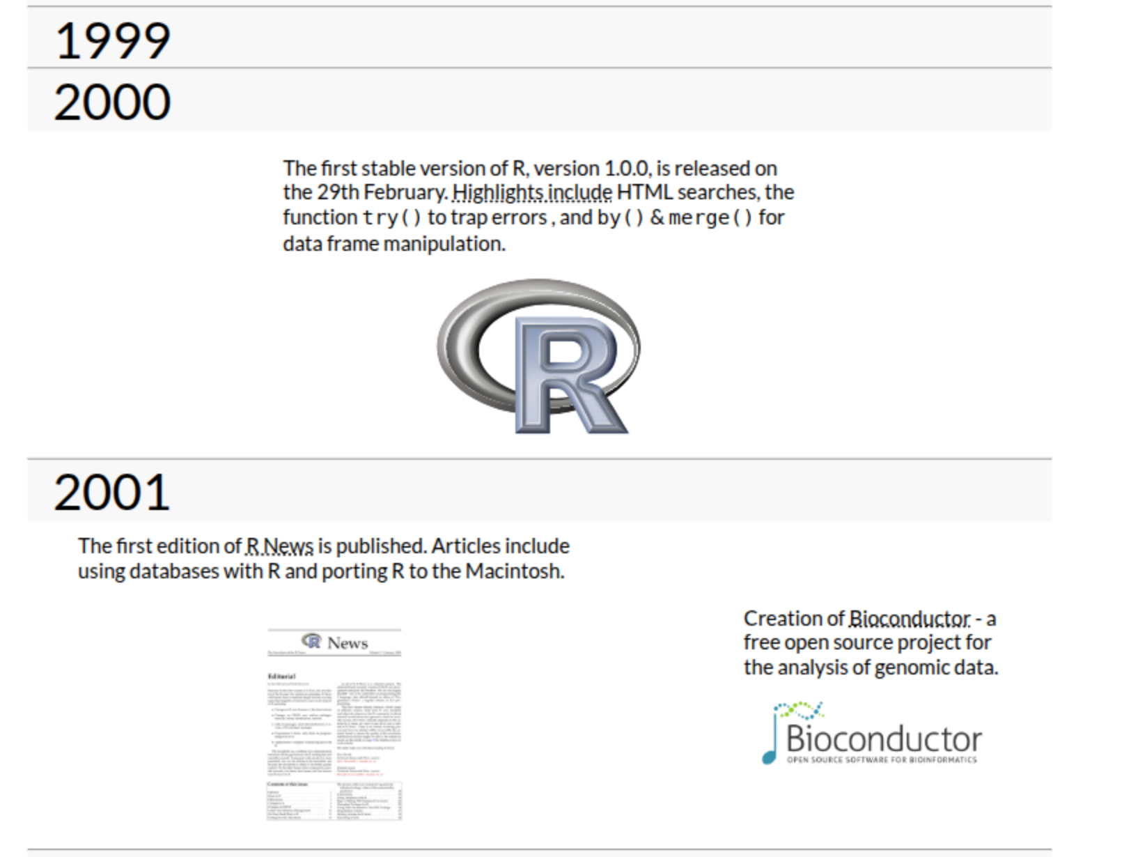
- a timeline showing the history of the R language, built with D3.js;
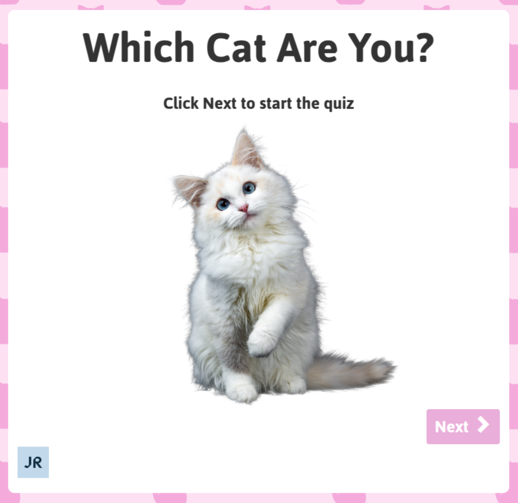
- a fun quiz to determine which cat you are;
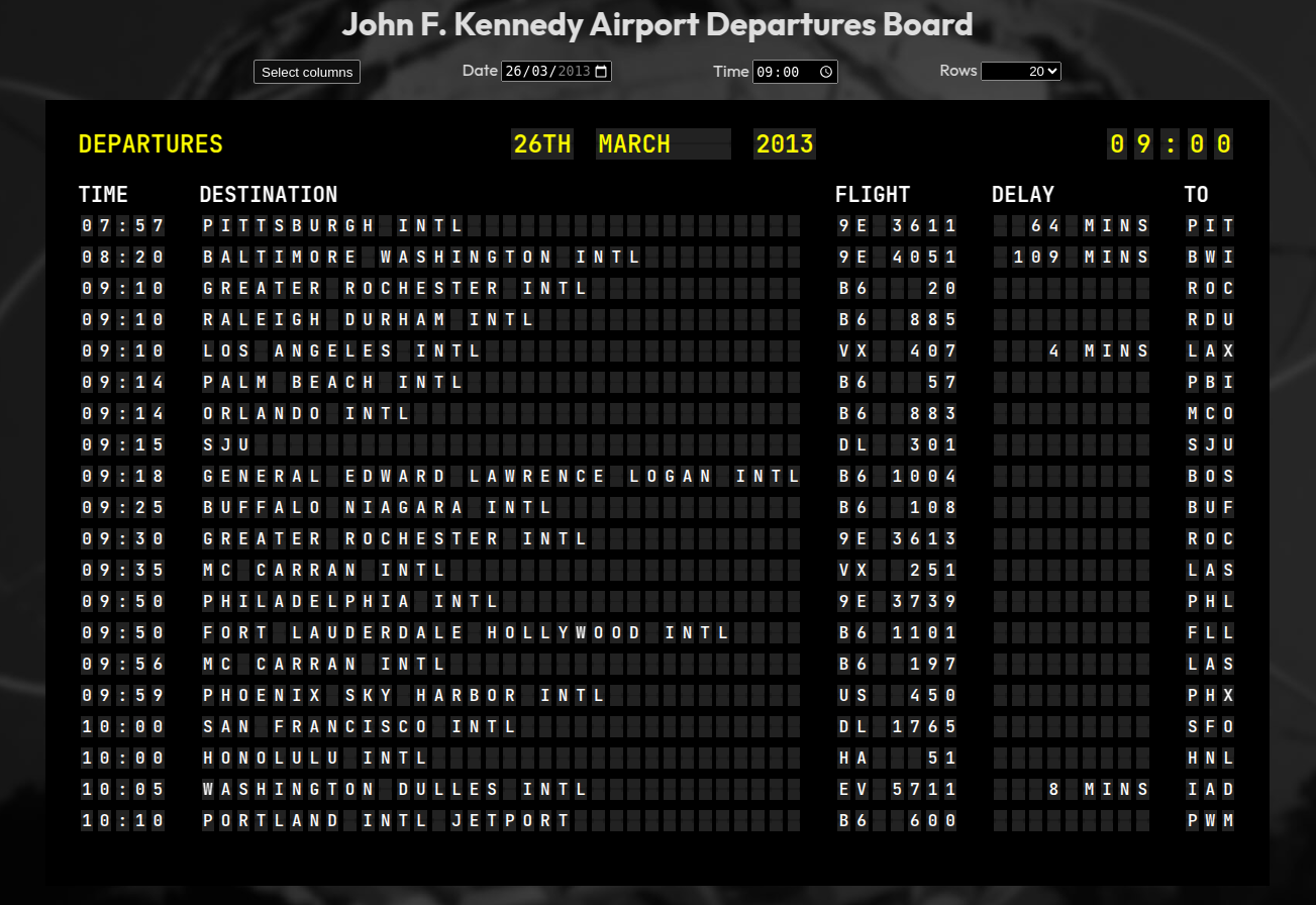
- an airport departure-board with interactively-selectable columns.
Please explore our dashboard gallery, and if you or your team have a project that would benefit from our expertise in dashboard development, deployment and the underlying infrastructure please contact us.