Styling Base R Graphics
Publication quality base R graphics
Base R graphics get a bad press (although to be fair, they could have chosen their default values better). In general, they are viewed as a throw back to the dawn of the R era. I think that most people would agree that, in general, there are better graphics techniques in R (e.g. {ggplot2}). However it is occasionally worthwhile making a plot using base R graphics. For example, if you have a publication and you want to make sure the graphics are reproducible in five years.
In this post we’ll discuss methods for dramatically altering the look and feel of a base R plot. With a bit (ok, a lot) of effort, it is possible to change all aspects of the plot to your liking.
Typically I detest the iris the data set. It’s perhaps the most over used dataset in the entire R world. For this very reason, we’ll use it in this post to show what’s possible ;)
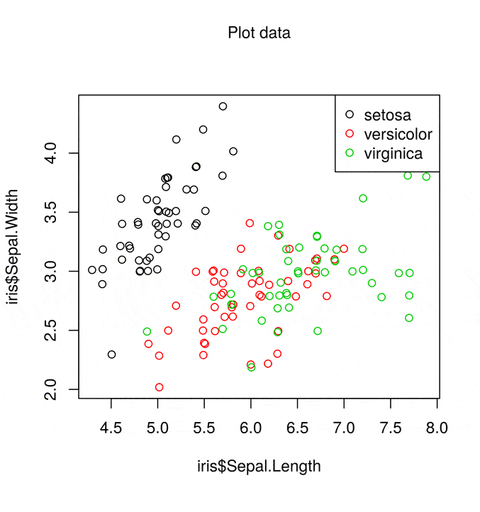
The standard base R scatter plot is
plot(iris$Sepal.Length, iris$Sepal.Width, col = iris$Species)
legend("topright", legend = levels(iris$Species), col = 1:3, pch = 21)

This gives a simple scatter plot with associated legend using the default colour scheme. The list of things wrong with the this plot is fairly lengthy, but not limited to
- Colours
- Margins
- Axis labels
- Overlapping points
- Wasted space
However with base R graphics we can fix all of these faults!
Fixing the problem
What’s not clear in the scatter plot above is that some points lie on top of each other. So the first step is to wiggle the points using the jitter() function to avoid points sitting on top of each other.
## Same as geom_jitter
iris$Sepal.Length = jitter(iris$Sepal.Length)
iris$Sepal.Width = jitter(iris$Sepal.Width)
Next we select nicer colours (I’ve taken this palette from the great I want hue website). The palette() function allows you to globally change the colour palette used by base R plots
alpha = 150 # Transparent points
palette(c(rgb(200, 79, 178, alpha = alpha, maxColorValue = 255),
          rgb(105, 147, 45, alpha = alpha, maxColorValue = 255),
          rgb(85, 130, 169, alpha = alpha, maxColorValue = 255)))
Next we alter a few plot characteristics with the par() function
par(mar = c(3, 3, 2, 1), # Dist' from plot to side of page
    mgp = c(2, 0.4, 0), # Dist' plot to label
    las = 1, # Rotate y-axis text
    tck = -.01, # Reduce tick length
    xaxs = "i", yaxs = "i") # Remove plot padding
Then it comes to the plot() function itself. This has now become a lot more complicated. We create the plot using the plot() function, with a number of arguments
plot(iris$Sepal.Length, iris$Sepal.Width,
     bg = iris$Species, # Fill colour
     pch = 21, # Shape: circles that can filed
     xlab = "Sepal Length", ylab = "Sepal Width", # Labels
     axes = FALSE, # Don't plot the axes
     frame.plot = FALSE, # Remove the frame
     xlim = c(4, 8), ylim = c(2, 4.5), # Limits
     panel.first = abline(h = seq(2, 4.5, 0.5), col = "grey80"))
then add in the x-axis tick marks
at = pretty(iris$Sepal.Length)
mtext(side = 1, text = at, at = at,
      col = "grey20", line = 1, cex = 0.9)
and the y-axis
at = pretty(iris$Sepal.Width)
mtext(side = 2, text = at, at = at, col = "grey20", line = 1, cex = 0.9)
This just leaves the legend. Instead of using the legend() function, we’ll place the names next to the points via the text() function
text(5, 4.2, "setosa", col = rgb(200, 79, 178, maxColorValue = 255))
text(5.3, 2.1, "versicolor", col = rgb(105, 147, 45, maxColorValue = 255))
text(7, 3.7, "virginica", col = rgb(85, 130, 169, maxColorValue = 255))
Finally, we have the plot title
title("The infamous IRIS data", adj = 1,
      cex.main = 0.8, font.main = 2, col.main = "black")
Putting it all together gives

A much better job.
Why not use ggplot2 (or something else)?
This seems like a lot of work to create a simple scatter plot. Why not use X, Y, or {ggplot2}? We even have a course on {ggplot2} so we’re not biased. The purpose of this article isn’t to get into a religious visualisation war on base R vs … However if you want such a war, have a look at the blog posts by Flowing Data, Jeff Leek and David Robinson.
One point that is worth making is that since we are only using base R functions, our plot will almost certainly be reproducible for all future versions of R! Not something to quickly dismiss.