Thinking about maps and ice cream
In November 2021, I took part in the third edition of the 30 Day Map Challenge created by Topi Tjukanov. Participants are given a theme for each day of November, and are tasked with creating a map within that theme. Details of the challenge can be found here. My own contributions can be found on GitHub.
Creating thirty maps was indeed a challenge, but over the course of the month I developed a process for approaching the problem. This blog post will focus more on my thought process behind creating maps (or any type of plot) rather than the technical aspects of writing the code.
I found it useful to at least loosely define what I wanted to get out of taking part in the challenge. The main motivation for me, was to play around and learn some new packages for dealing with spatial data since I hadn’t worked with that type of data before. For you, it might be something completely different e.g. making your first map, developing better graphics, or exploring data sources.
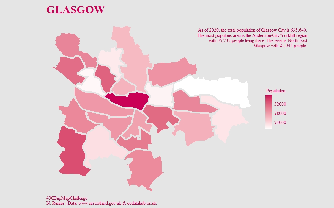
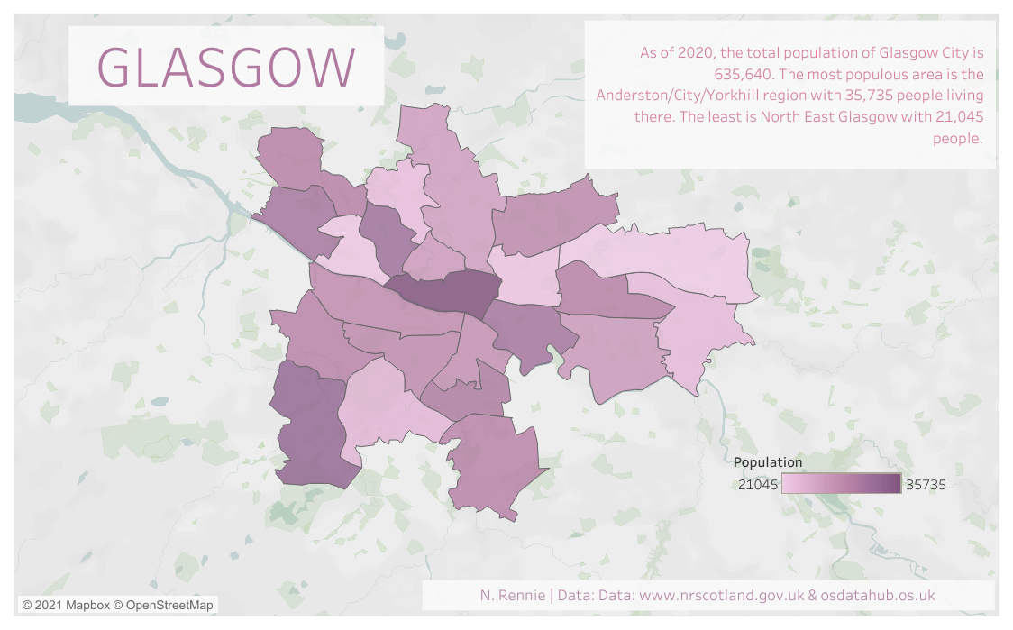
For example, I made the same plot multiple times using different tools. For day 3, I created a map of Glasgow’s population using {ggplot2} and then recreated it using Tableau for day 14. The maps themselves didn’t teach me anything new about Glasgow’s population, but I did learn about the main differences in processing spatial data using R versus Tableau.
Thinking about themes
The only direction participants are given is the theme for each day. To avoid bias of thinking about a theme for which I’ve already created a map, I’ll go through my process with a new unseen theme: beaches. The theme is the first thing I focused on. Otherwise, you can make a map about absolutely anything which makes it really hard to settle on something to plot. A bit like when you spend a lot of time browsing Netflix but never actually pick anything to watch.
I also narrowed my geographical focus for the challenge to just the United Kingdom. “Create 30 maps of the UK” sounded less intimidating than “create 30 maps”. I did that for this map too.
Anyway, back to the theme of beaches. First, I tried to brainstorm a few different ideas that could work. Sometimes an idea might be quite obvious, other times more abstract…
- Plotting British coastlines?
- Highlighting beaches suitable for swimming?
- Filming locations of the movie Beaches?
It’s also useful to choose a topic you’re interested in, especially if you’re making maps for fun. Otherwise, what’s the point? For this map, I settled on the semi-abstract topic of ice cream. No day at the beach is complete without a 99, after all.
Digging for data
Unlike many other data visualisation challenges (such as #TidyTuesday), participants in the 30 Day Map Challenge need to find their own data sources. The narrower geographical region I’d confined myself to, also made it easier to find data as I was familiar with possible data sources.
For most of the maps I made, I needed at least two data sources: (i) a background map, and (ii) some interesting data related to the theme to overlay.
Background maps of the UK are available from the Office for National Statistics Geoportal (among other places), and I reused these multiple times during the challenge. Reusing it once more here won’t hurt.
Whilst organisations like the Office for National Statistics have lots of data on life in the UK, I couldn’t find a public data set specifically on ice cream in the UK. Luckily, ice cream shops are classified as an amenity by OpenStreetMap (a classification I firmly agree with). OpenStreetMap is a collaborative project which aims to create a free database of global geodata. It can be accessed directly through the Overpass API, but it’s neatly wrapped into an R package called {osmdata}.
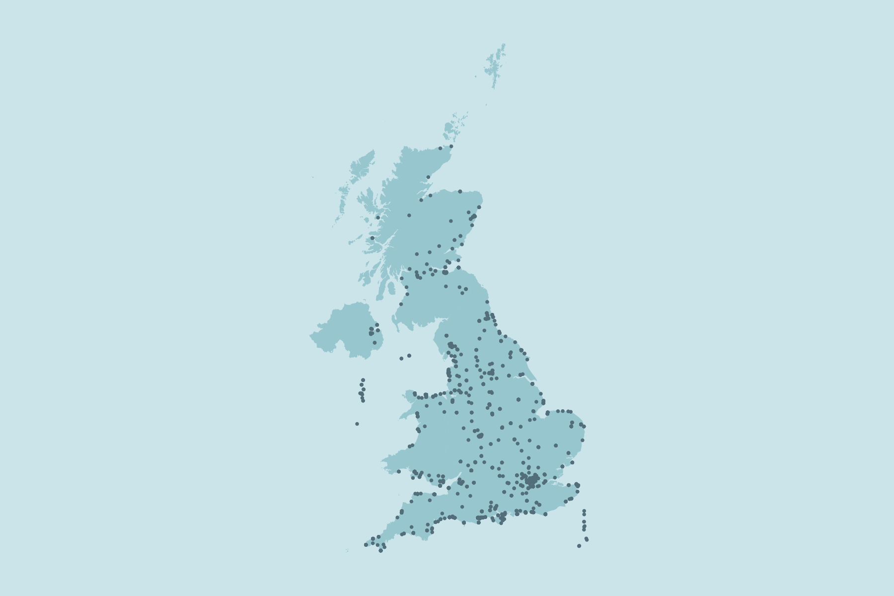
I used the {osmdata} package multiple times during the challenge because it’s compatible with the {tidyverse} packages, including {ggplot2} so I didn’t have to spend time formatting my data sources. The map I created for the theme red on day 6 of the 30 Day Map Challenge was a map of all the post offices in the UK using OpenStreetMap data, the code for which is available on GitHub.

Unfortunately, OpenStreetMap returns a list of all ice cream shops within a rectangular geographic area rather than within a chosen country. It also returns some ice cream shops on the East coast of Ireland, and a few in France as well. Some of the meta-data for the ice cream shops is missing so there’s no easy way to filter them out. Given the time constraints of the map challenge, I decided to ignore them. For a more professional map, I’d spend the time removing those points.
Do you use RStudio Pro? If so, checkout out our managed RStudio services
Now what?
At this stage, I have all the data I need. I often think it’s useful to (loosely) define a question that your plot will answer. At the moment, I have data on ice cream shops all over the UK. But I probably don’t want to focus on all of them. The question I want to answer: How many ice cream shops are within a 10 mile radius of the Jumping Rivers office?
Making maps
There are a couple of technical aspects of creating maps that I had to learn to make this map:
- transforming between coordinates systems. The OpenStreetMap data was in the World Geodetic System coordinates, and the base maps were in Ordnance Survey of Great Britain coordinate systems. To plot them together, they both have to be in the same coordinate system.
- creating a circular area around the Jumping Rivers office and determining which points were inside the 10 mile radius.
If you’re an R user who is at all interested in working with spatial data, then the {sf} package is your friend. It’s compatible with {ggplot2} and I could create a basic map of my data using just those two packages.
In terms of design, the {patchwork} and {cowplot} packages are invaluable for arranging multiple plots, and adding annotations outside of the plot area. This is useful if you want to add some additional text explaining your plot. Maps are almost always improved with a textual explanation, and I don’t think all maps need to be completely understandable without any text. For this map, I also used an inset zoomed-in map to show the detail that you can’t see in the UK-wide map alone.
Then, with a little splash of colour to highlight the important aspects, the final map is finished. Is it perfect? No. There are lots of little things that I would like to fix about this map, and if I was using this map for a project I would probably take the time to fix those things. But with a challenge where you’re making a map every day, you need to draw a line somewhere. And this is where I drew it today.
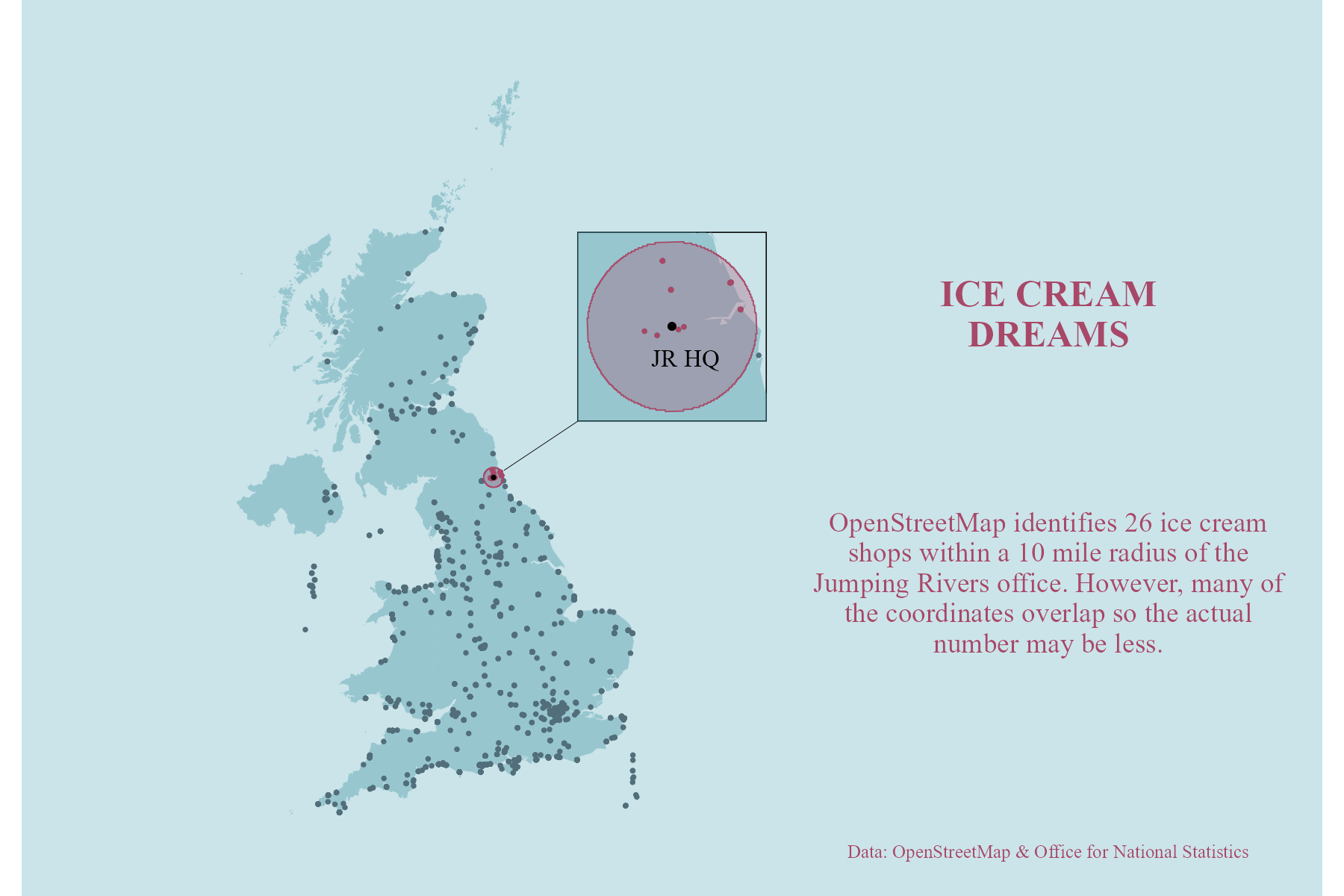
If you’re curious, OpenStreetMap says that there are 26 ice cream shops within a 10 mile radius of the Jumping Rivers office but I’m not sure the data is completely reliable. That’s one of the pitfalls of using a community generated dataset that I just have to accept for now.
Final thoughts
Taking part in the 30 Day Map Challenge was really beneficial, although sometimes slightly stressful. I learnt a lot about finding data, got better at plotting maps (mostly in R), and found out some cool facts that might help me in a pub quiz one day. Next year, rather than creating a map for the sake of ticking off a day, I’d like to spend more time on each individual map and delve a bit deeper into some of the new packages I find.
If you’re looking for some inspiration when creating your own maps, I’d recommend checking out the 30 Day Map Challenge website or searching the #30DayMapChallenge on Twitter.
If you’re interested in learning how to work with spatial data in R, the Geocomputation with R book is an excellent free book, or you could come to our Spatial Data Analysis with R course.