Time Series Forecasting in Python

In this post we will be introducing the concept of time series forecasting, with a focus on the ARIMA framework and how this can be implemented in Python. We will be using a publicly available data set and the following open source packages:
Time series
In time series analysis we are interested in sequential data made up of a series of observations taken at regular intervals. Examples include:
- Weekly hospital occupancy
- Monthly sales figures
- Annual global temperature
In many cases we want to use the observations up to the present day to predict (or forecast) the next N time points. For example, a hospital could reduce running costs if an appropriate number of beds are provisioned.
This is where time series modelling fits in. The most basic time series model is a simple linear regression, where we assume that the time series evolves linearly over time. For non-linear time series we can consider piecewise linear regression.
What about more complex cases where we want to accurately capture subtle variations in the data? We will now demonstrate the ARIMA framework in Python using a real world data set.
ARIMA
ARIMA stands for “Auto-Regressive Integrated Moving Average” and is made up of three key parts:
- Auto-regression: captures the relationship between an observation and the last k points (often referred to as “lagged” observations).
- Integration: accounts for “non-stationary” trends by taking the difference between consecutive observations (a non-stationary trend could include an overall upward trend where the mean observation is increasing over time).
- Moving average: accounts for the relationship between an observation and the residual error that would result from using a moving average model applied to the lagged observations.
The three components (AR, I, MA) are controlled by the parameters (p, d, q). Setting one of these to zero will eliminate that component of the model. For example, if the time series already appears to be stationary we could set d = 0 so that we do not perform differencing.
To demonstrate ARIMA on a real-world example, let’s load in the flights
data set from the seaborn library:
import seaborn as sns

flights = sns.load_dataset("flights")
flights.head()
##    year month  passengers
## 0  1949   Jan         112
## 1  1949   Feb         118
## 2  1949   Mar         132
## 3  1949   Apr         129
## 4  1949   May         121
Let’s visualise the data:
import matplotlib.pyplot as plt

plt.plot(flights["passengers"])
plt.xlabel("month")
plt.ylabel("passengers")
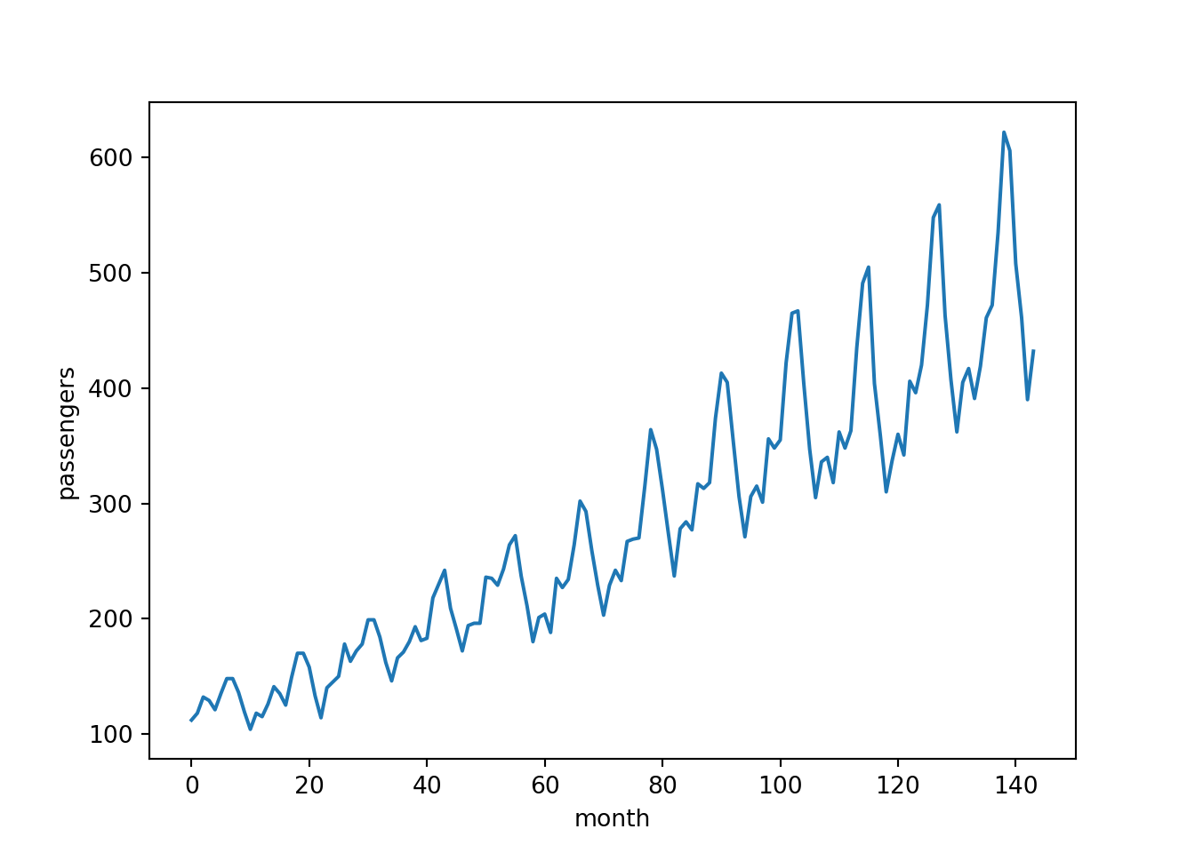
The data includes the number of passengers that flew each month over a period of 12 years. We will start by fitting a model on the full data set, then try holding out some test data for forecasting.
Data inspection
We should begin by exploring the time series. There are a number of questions that could be asked. For example:
- Is the trend non-stationary?
- Does the plot feature a seasonal variation?
Just from looking at the plot above the answer to both of these questions is a clear “yes”! But what if the data was more noisy and it was not clear from a quick visual inspection? In that case we could try decomposing the time series into the following components:
- Trend
- Seasonal
- Residual (i.e. after we have subtracted the trend and seasonal components)
Fortunately the statsmodels library has a seasonal_decompose()
function for this exact purpose:
from statsmodels.tsa.seasonal import seasonal_decompose

y = flights["passengers"] # convenience variable
decomposition = seasonal_decompose(y, period=12)
For convenience we have assigned the passengers column of the original
DataFrame to a variable called y. Because we expect a seasonal
variation in the data we have chosen a period of 12 months. Let’s
inspect the decomposition:
decomposition.plot()
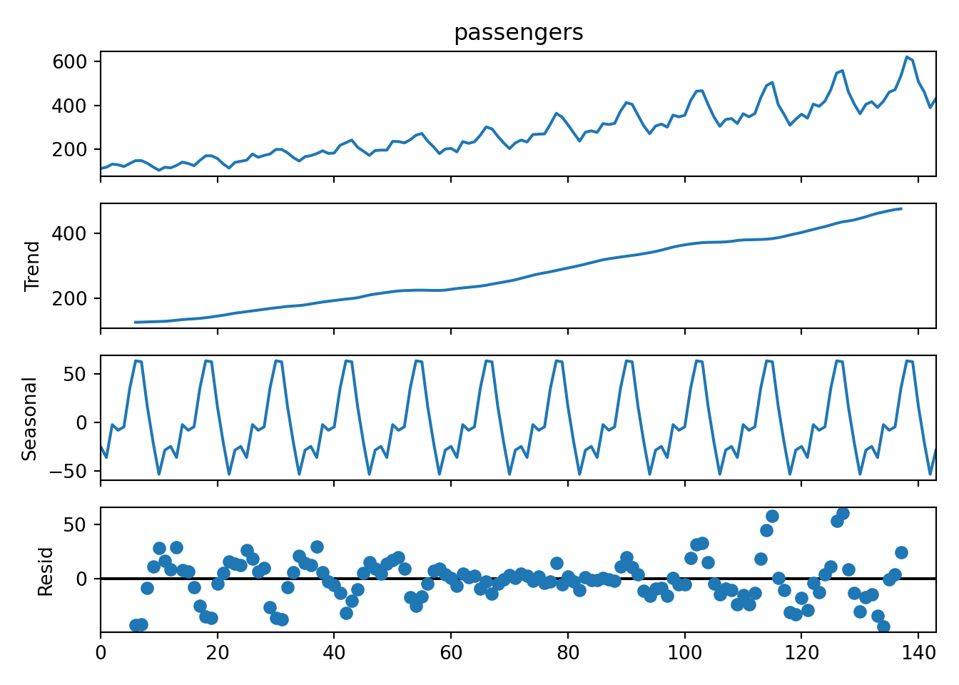
- The top panel shows the original raw time series.
- In the second panel we see that there is indeed an increasing trend. We will therefore need to include some differencing in the model (d > 0).
- The third panel shows the repeating seasonal component.
- The fourth panel shows that there is still a non-random residual after the trend and seasonal component have been subtracted. This can result from the fact that the seasonal “peaks” in the original plot appear to grow in amplitude over time (i.e. it is not really a fixed seasonal pattern).
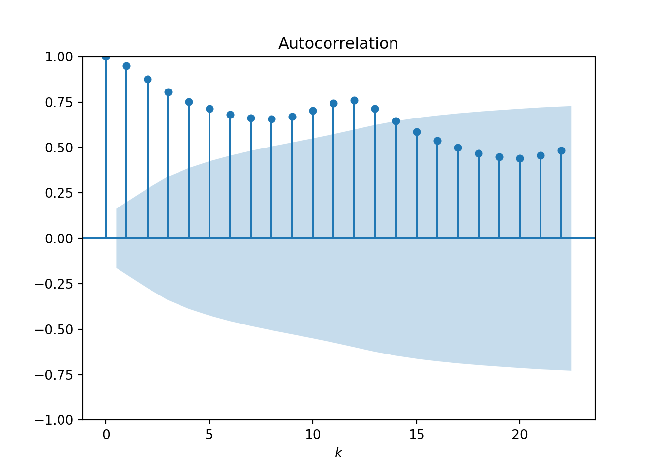
It is also important to study the autocorrelation function (ACF) and
partial autocorrelation function (PACF). Again, the statsmodels
library has everything we need:
- The ACF plot shows how correlated observations are with other observations that are k time points away (we call this “lag-k”):
from statsmodels.graphics.tsaplots import plot_acf, plot_pacf

plot_acf(y)
plt.xlabel("$k$")
- The PACF plot shows the “direct” correlation between observations at lag-k after removing the linear dependence of intermediate lags:
plot_pacf(y)
plt.xlabel("$k$")
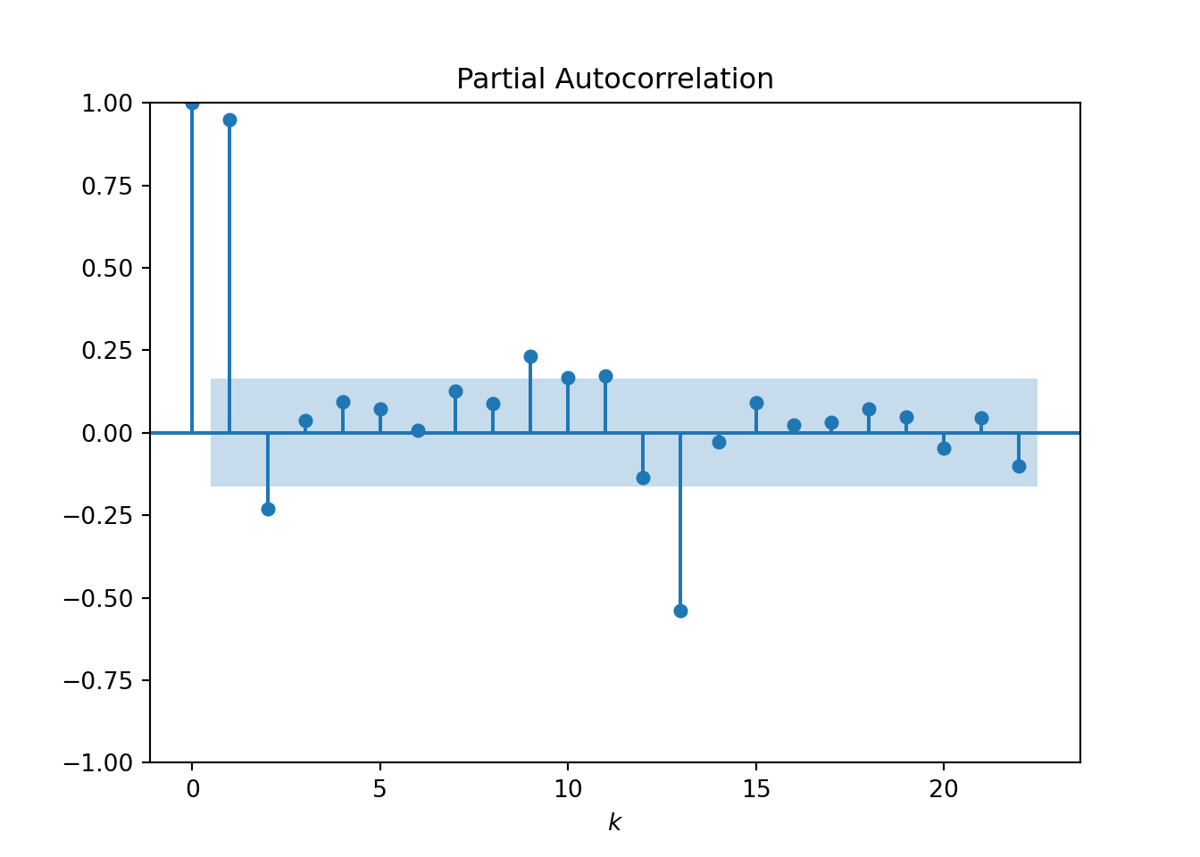
Both plots start with a lag of 0, where the correlation is always 1. The ACF and PACF then typically drop down to close to zero. The point at which this happens can help to inform the values for our p and q parameters:
- The value of k at which the ACF reduces to statistically insignificant values is regarded as a good choice for the q parameter. From the plot we see the ACF drops close to the confidence region at approximately k = 10.
- The value of k at which the PACF appears to drop close to 0 is a sensible choice for the p parameter. Here the value k = 2 appears reasonable.
These are really just educated guesses. In practice it would be worth experimenting with the ranges 1 < = p < = 3 and 5 < = q < = 15 (we’ll not worry about this here).
The d parameter controls the amount of differencing:
- d = 1 means we take the difference between every observation and the previous observation.
- d = 2 means we difference the differenced time series again.
- … and so on.
The process should continue until the non-stationary trend is regarded as statistically insignificant. This can be done by eye, but a better way is to use the Augmented Dickey-Fuller (ADF) test:
from statsmodels.tsa.stattools import adfuller

adfuller(y)
## (0.8153688792060528, 0.9918802434376411, 13, 130, {'1%': -3.4816817173418295, '5%': -2.8840418343195267, '10%': -2.578770059171598}, 996.6929308390189)
The first two values returned give us the test statistic and p-value for the null hypothesis, respectively. We also get the critical value cutoffs at the 1%, 5% and 10% levels. Without going into too much detail, the general rule is that if the test statistic is greater than the 5% cutoff then the null hypothesis is accepted, meaning that the trend is non-stationary.
In our case we should consider differencing the data and trying again.
Let’s use the diff() function from statsmodels:
- Taking a single difference results in a test statistic that is comparable to the 5% cutoff:
from statsmodels.tsa.statespace.tools import diff

adfuller(diff(y))
## (-2.829266824169999, 0.05421329028382552, 12, 130, {'1%': -3.4816817173418295, '5%': -2.8840418343195267, '10%': -2.578770059171598}, 988.5069317854084)
- Taking a second difference results in a test statistic that is much lower than even the 1% cutoff:
from statsmodels.tsa.statespace.tools import diff

adfuller(diff(y, k_diff=2))
## (-16.38423154246854, 2.7328918500140445e-29, 11, 130, {'1%': -3.4816817173418295, '5%': -2.8840418343195267, '10%': -2.578770059171598}, 988.6020417275605)
We see that a second order difference (d = 2) produces a stationary trend according to the ADF test. It is important to avoid excessively high choices of d since this can introduce artefacts in the final model. So in practice it would be worth experimenting with both d = 1 and d = 2.
What about the seasonal trend in the data? This suggests that we should really be using the SARIMA framework (where the S stands for “seasonal”). That would involve twice the number of parameters, so let’s proceed with our simplified model and see how we get on.
Model fitting
Having analysed the time series we have arrived at a reasonable choice of our parameters: (p, d, q) = (2, 2, 10). As stated above, in practice we should really test a range of values but for now we will not worry.
The statsmodels library provides an ARIMA object for model fitting
and forecasting. Let’s call it with our parameter choices:
from statsmodels.tsa.arima.model import ARIMA

model = ARIMA(y, order=(2, 2, 10))
model_fit = model.fit()
We can inspect the model using:
model_fit.summary()
## <class 'statsmodels.iolib.summary.Summary'>
## """
##                                SARIMAX Results
## ==============================================================================
## Dep. Variable:             passengers   No. Observations:                  144
## Model:                ARIMA(2, 2, 10)   Log Likelihood                -673.434
## Date:                Wed, 27 Aug 2025   AIC                           1372.867
## Time:                        14:21:20   BIC                           1411.293
## Sample:                             0   HQIC                          1388.482
##                                 - 144
## Covariance Type:                  opg
## ==============================================================================
##                  coef    std err          z      P>|z|      [0.025      0.975]
## ------------------------------------------------------------------------------
## ar.L1          0.0376      0.027      1.386      0.166      -0.016       0.091
## ar.L2         -0.9770      0.026    -37.090      0.000      -1.029      -0.925
## ma.L1         -0.4439    153.608     -0.003      0.998    -301.510     300.622
## ma.L2          0.9971    142.058      0.007      0.994    -277.432     279.426
## ma.L3         -0.4440     90.869     -0.005      0.996    -178.543     177.655
## ma.L4          0.2001    163.089      0.001      0.999    -319.449     319.849
## ma.L5         -0.2122    163.925     -0.001      0.999    -321.499     321.075
## ma.L6          0.2396    165.114      0.001      0.999    -323.377     323.857
## ma.L7         -0.0025     79.453  -3.19e-05      1.000    -155.728     155.723
## ma.L8         -0.6393    156.926     -0.004      0.997    -308.208     306.930
## ma.L9          0.1965    136.829      0.001      0.999    -267.984     268.377
## ma.L10        -0.8908      0.125     -7.104      0.000      -1.137      -0.645
## sigma2       660.0238      1.030    640.771      0.000     658.005     662.043
## ===================================================================================
## Ljung-Box (L1) (Q):                   0.42   Jarque-Bera (JB):                10.61
## Prob(Q):                              0.52   Prob(JB):                         0.00
## Heteroskedasticity (H):               6.53   Skew:                             0.08
## Prob(H) (two-sided):                  0.00   Kurtosis:                         4.33
## ===================================================================================
##
## Warnings:
## [1] Covariance matrix calculated using the outer product of gradients (complex-step).
## [2] Covariance matrix is singular or near-singular, with condition number 1.78e+22. Standard errors may be unstable.
## """
The summary of the fit provides the log likelihood, AIC and BIC metrics. If you’re testing different choices of the (p, d, q) parameters it’s worth comparing the AIC and BIC metrics (lower values suggest a better fit).
The model summary also includes a couple of warnings, in this case concerning the covariance matrix. We will not worry about these messages for now, and inspect model residuals and forecasting ability as a way of assessing the quality of the fit.
Using pandas we can inspect the residuals:
import pandas as pd

residuals = pd.DataFrame(model_fit.resid)
residuals.describe()
##                 0
## count  144.000000
## mean     0.489740
## std     28.441220
## min    -91.170547
## 25%    -14.729881
## 50%     -0.702994
## 75%     16.190037
## max    112.000000
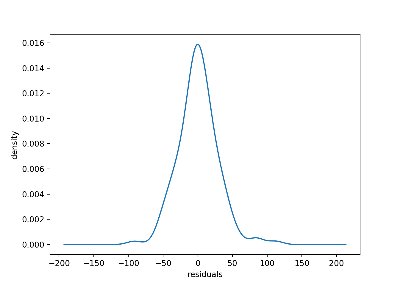
The residuals appear to be distributed close to zero.
residuals.plot(kind="kde", legend=False)
plt.xlabel("residuals")
plt.ylabel("density")
We can also plot the residuals over time to inspect the outliers.
residuals.plot(legend=False)
plt.hlines(0, 0, 144, color="black")
plt.xlabel("month")
plt.ylabel("residuals")
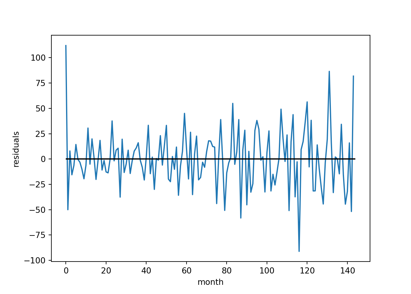
For an initial model this appears reasonable.
Forecasting
Now that we have a model we can try forecasting future time points. There are a number of possible use cases:
- We may only be interested in forecasting the next month. We can simulate this with our data set by using a “rolling forecast” where the model is retrained on all of the data up to the current time point before predicting the next time point.
- The model could also be used for quarterly or yearly forecasting, where we predict multiple future time points at once.
Let’s go with approach 1 first. We will start by splitting the time series into an initial training set and a hold-out test set:
y_values = list(y.values)
train, test = y_values[:96], y_values[96:132]
Since time series models are typically used to forecast into the future, a common practice for testing is to remove the end of the time series from the training set and hold it out for testing. Here we have set aside 3 years of data for testing.
We will now simulate 3 years worth of monthly forecasting, where every
month we retrain the model with the latest data and produce a forecast
for the next month. Forecasts are produced using the .forecast()
method, which predicts the next time point by default.
predictions = []
current_params = None
for i in range(len(test)):
    model = ARIMA(train, order=(2, 2, 10))
    model_fit = model.fit(start_params=current_params)
    current_params = model_fit.params # update the parameters
    output = model_fit.forecast()
    predictions.append(output[0]) # store the prediction
    train.append(test[i]) # update the training set
Depending on the model complexity this can take a few minutes to run
(the above code chunk took 1-2 minutes). To save some optimisation time,
at every time step we have used the best-fit parameters produced for the
previous model as the starting parameters for the next model (using the
start_params argument).
We now have a list of predictions to compare against our test observations. Let’s plot these together and compute the root-mean-squared error (RMSE):
from sklearn.metrics import mean_squared_error
import numpy as np

rmse = np.sqrt(mean_squared_error(test, predictions))
print(f"RMSE: {rmse}")
## RMSE: 30.875187739583858
plt.plot(test, color="blue", label="observed")
plt.plot(predictions, color="red", label="ARIMA")
plt.xlabel("month")
plt.ylabel("passengers")
plt.legend()
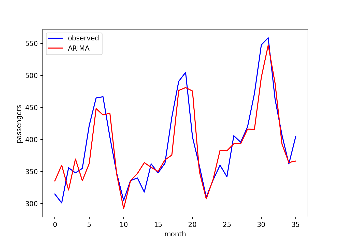
The agreement looks reasonable.
Alternatively, we may want to predict all 12 months in the next year. Let’s use the final 12 months of data (which were left out of the above analysis):
test = y_values[132:]
We now retrain the model on the first 11 years worth of data and this time use it to forecast the next 12 months:
model = ARIMA(train, order=(2, 2, 10))
model_fit = model.fit()
output = model_fit.forecast(steps=12) # predict 12 time points
predictions = output[:12] # store the predictions
Let’s compare the predictions with the test observations:
rmse = np.sqrt(mean_squared_error(test, predictions))
print(f"RMSE: {rmse}")
## RMSE: 73.86518520797583
plt.plot(test, color="blue", label="observed")
plt.plot(predictions, color="red", label="ARIMA")
plt.xlabel("month")
plt.ylabel("passengers")
plt.legend()
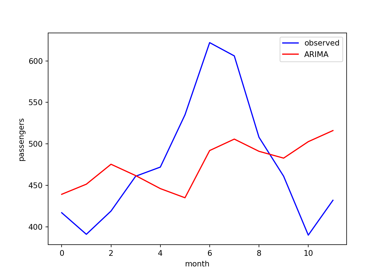
The agreement is poor here. As noted earlier, ARIMA does not account for
seasonal variation and we can see here the model is not able to
reproduce the peak at month 6. It would therefore be worth repeating
this analysis with the SARIMA method, which is also implemented in
statsmodels.
Summary
In summary, we have introduced the ARIMA framework for time series
forecasting using a real world example in Python. Along the way, we have
learned about popular data visualisations for time series data and
explored the time series analysis functions provided by the
statsmodels package. Check out the statsmodels
documentation for more
examples.
It’s worth mentioning that, while ARIMA is a powerful method for time series forecasting, there are a number of other popular frameworks for different use cases:
- SARIMA: expands on ARIMA by including a seasonal variation.
- Prophet: an alternative time series framework that can capture yearly, weekly and daily seasonality.
- DeepAR: an efficient deep learning algorithm designed to fit multiple time series with a single global model. This can outperform ARIMA in scenarios where hundreds of time series have to be modelled.
We may revisit these models in a later post. In the meantime, check out our recent blog series on MLOps, including model versioning, deployment and monitoring using the Vetiver framework.