Branding Toolkit
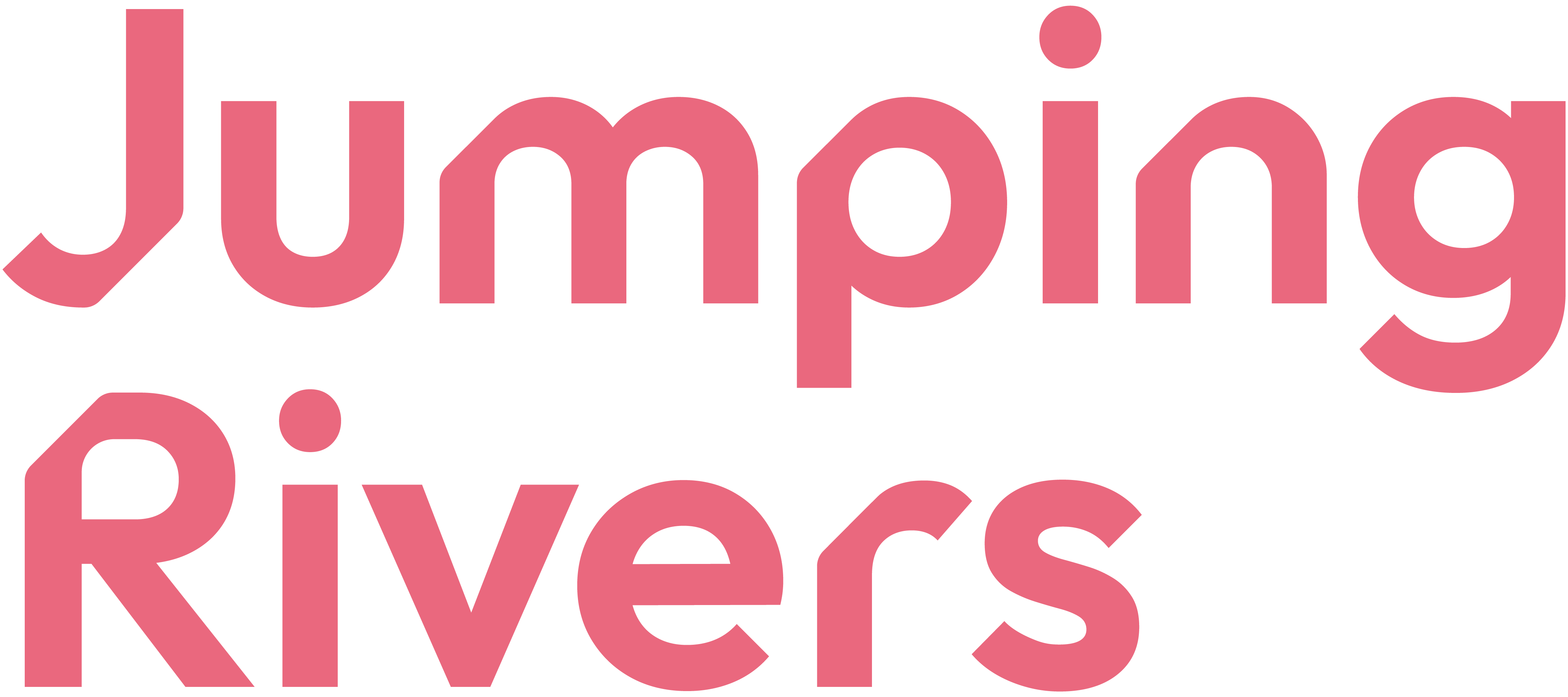
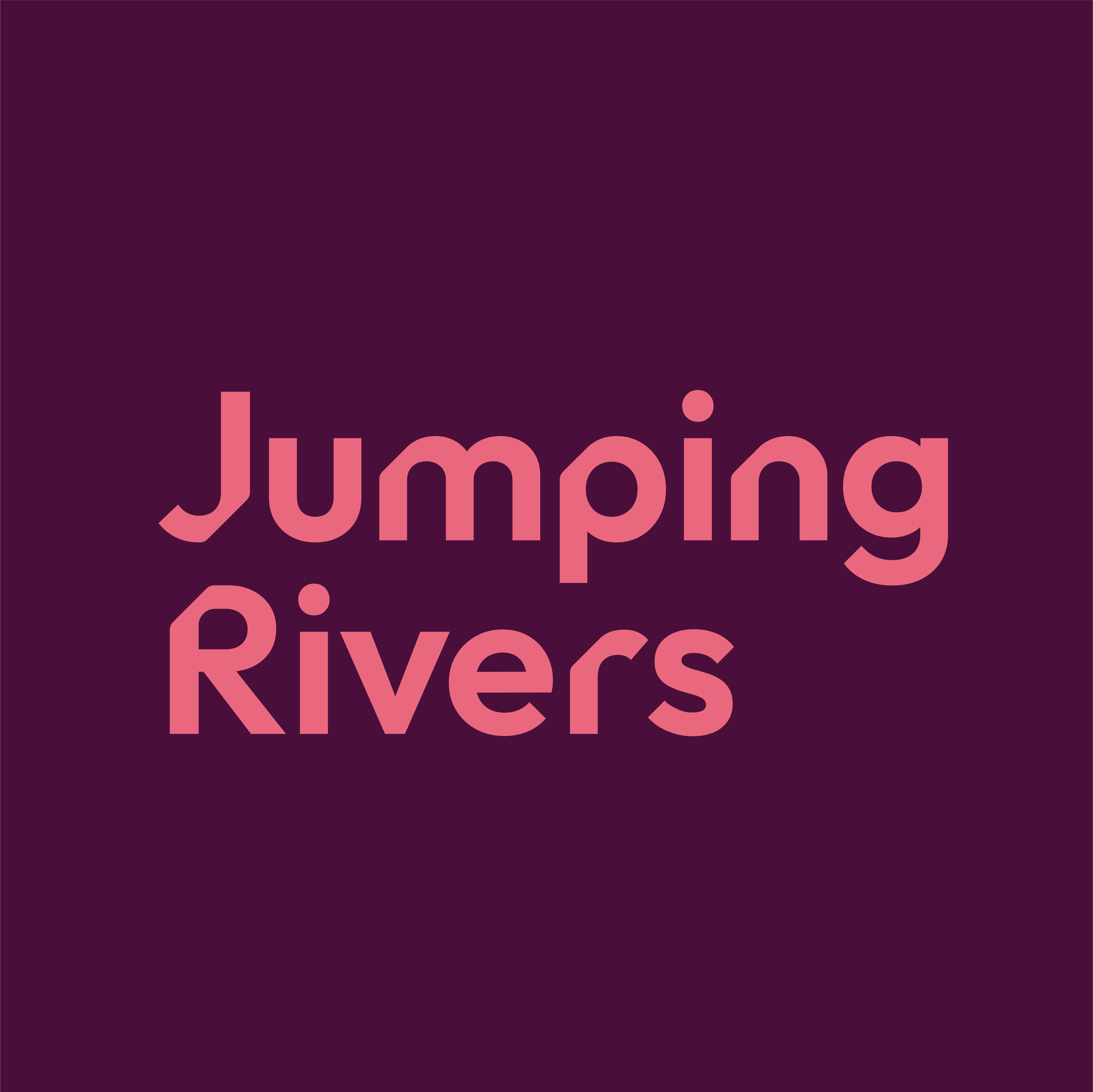
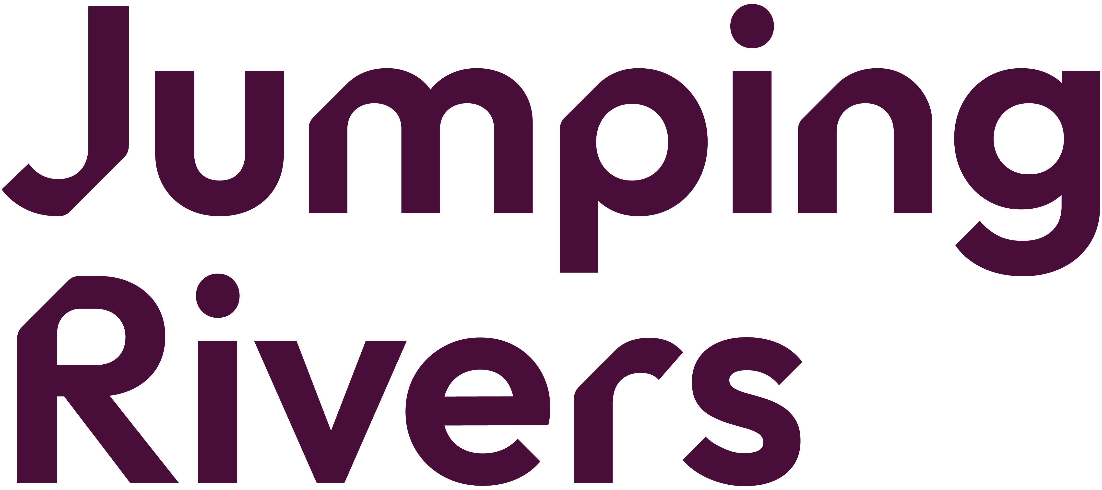
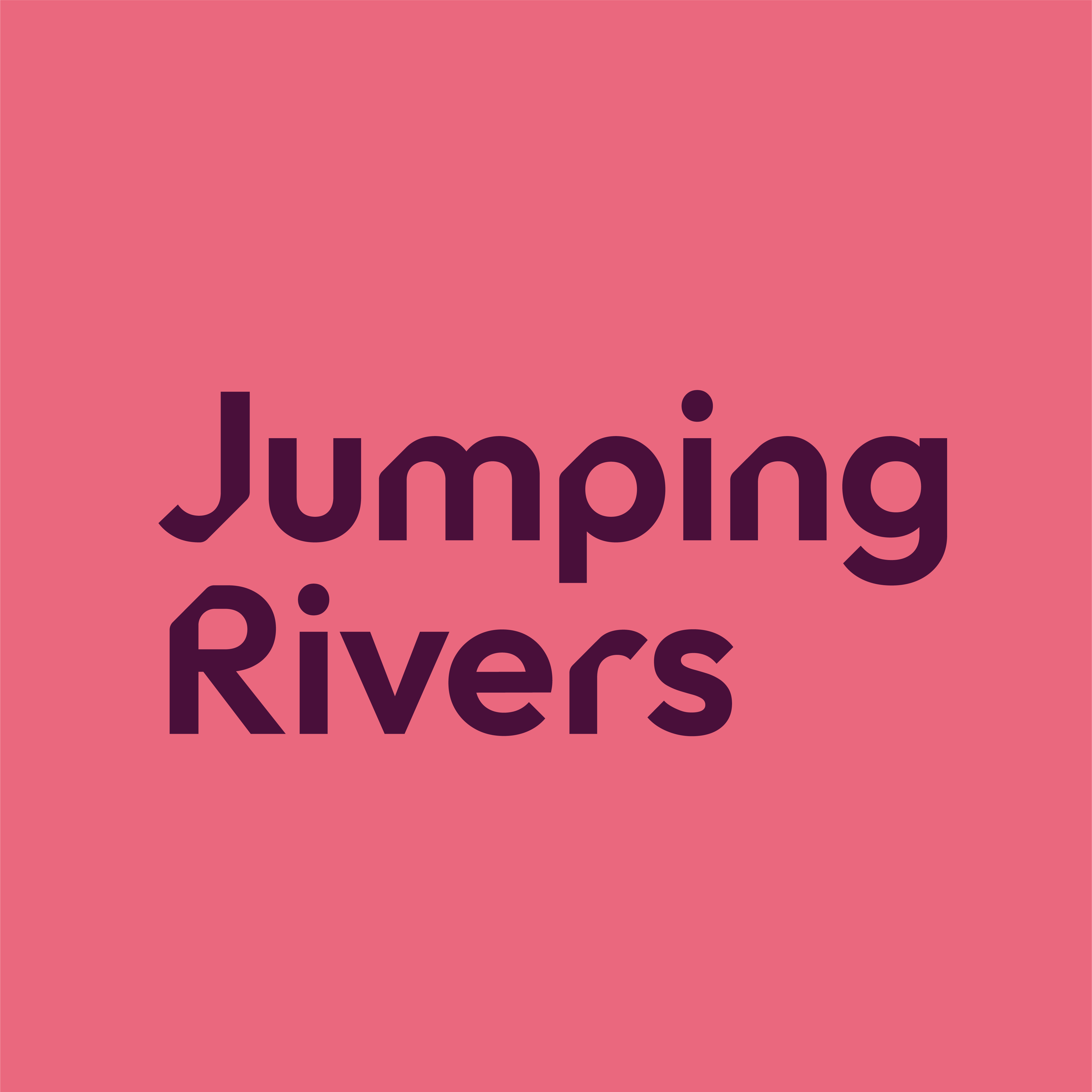
Several versions of the Jumping Rivers logo are available. Our primary logo should be used in the first instance. Where the background on which is placed would offer insufficient contrast, the secondary logo may be used instead. Alternative logos are also available if needed.
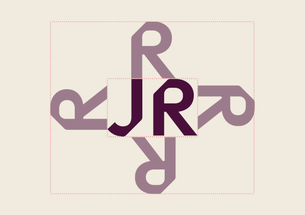
Clear zones
To maintain the integrity of our logo, we have created a clear zone around it.
No graphics or text should sit within this zone. There should be the height of the letter ‘R’ around the logo as demonstrated here.
Minimum sizes
The size stipulated as a minimum size is given as a guide to help maintain the integrity of the brand logo during reproduction.
In print, the logo should never be reproduced at less than 12mm high.
On screen, the logo should never be reproduced at less than 100px high.


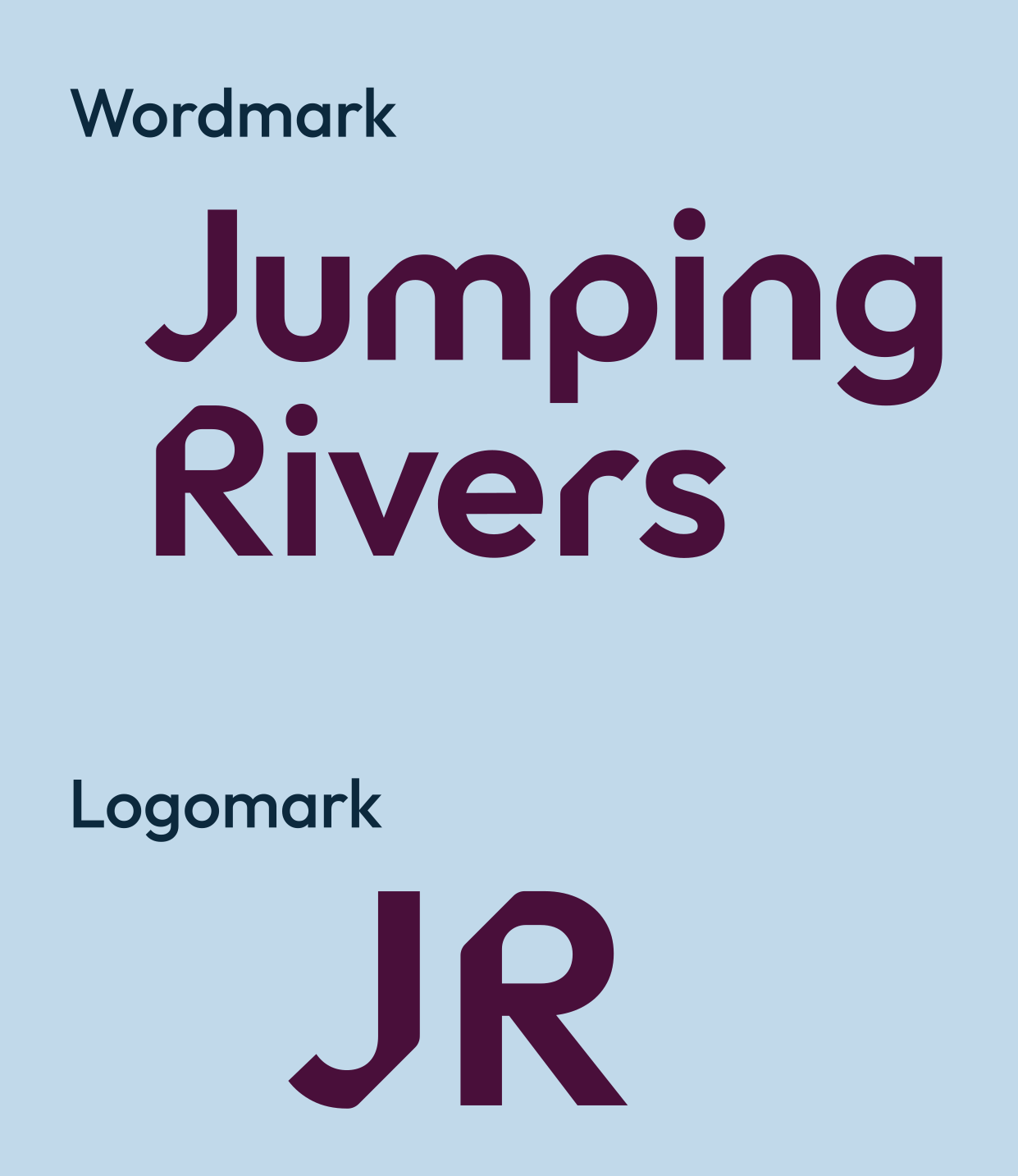
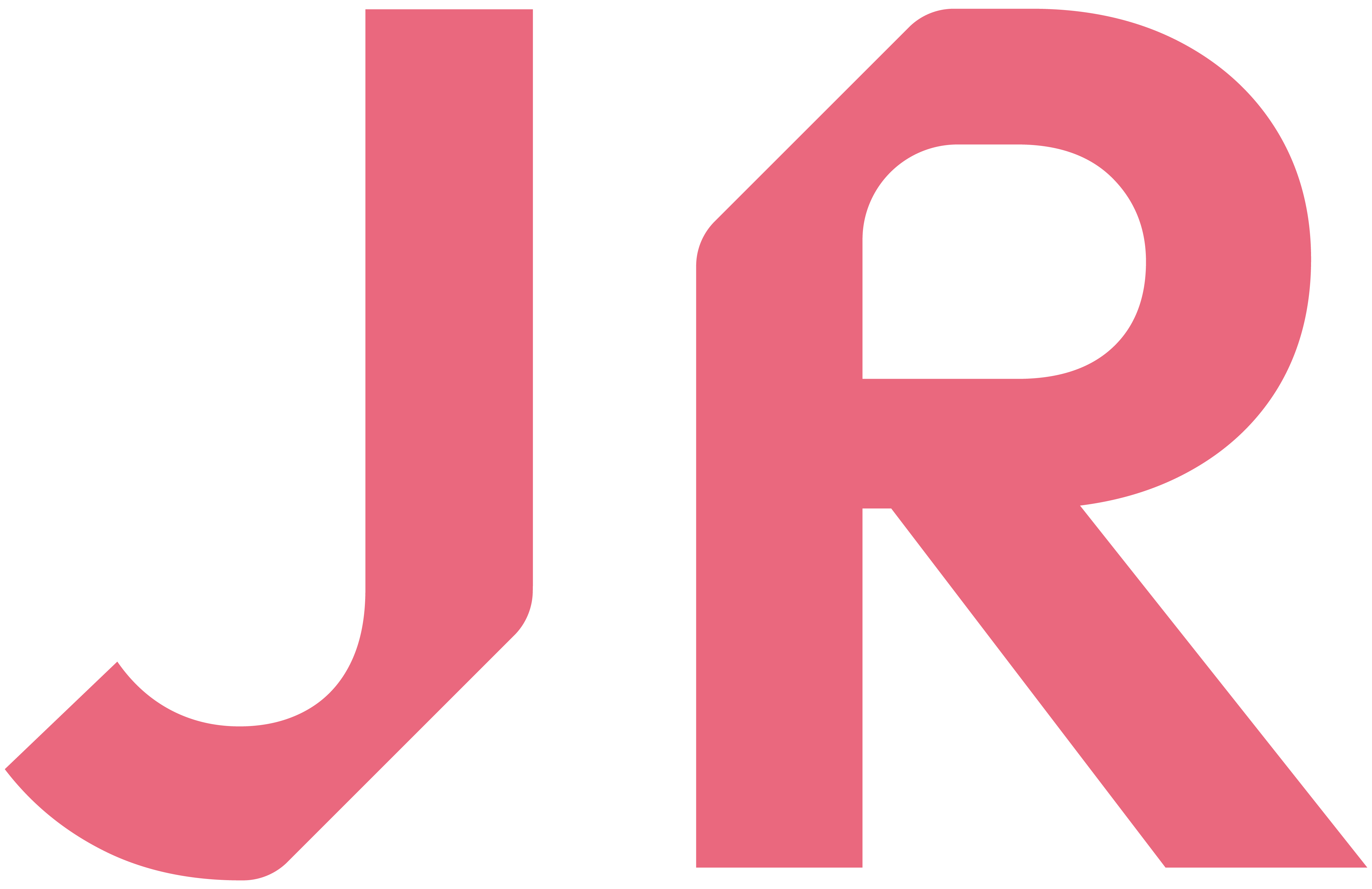
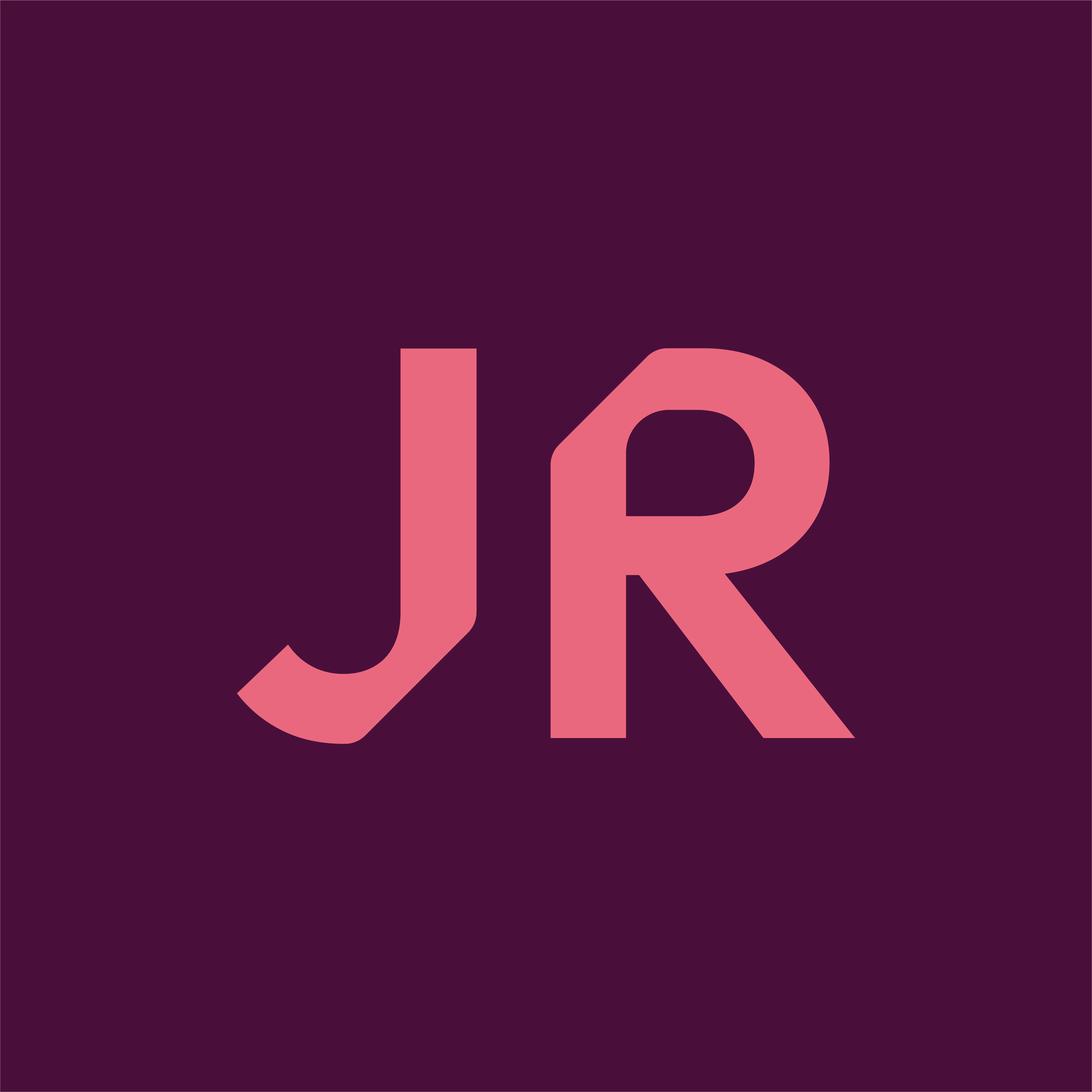
Usage
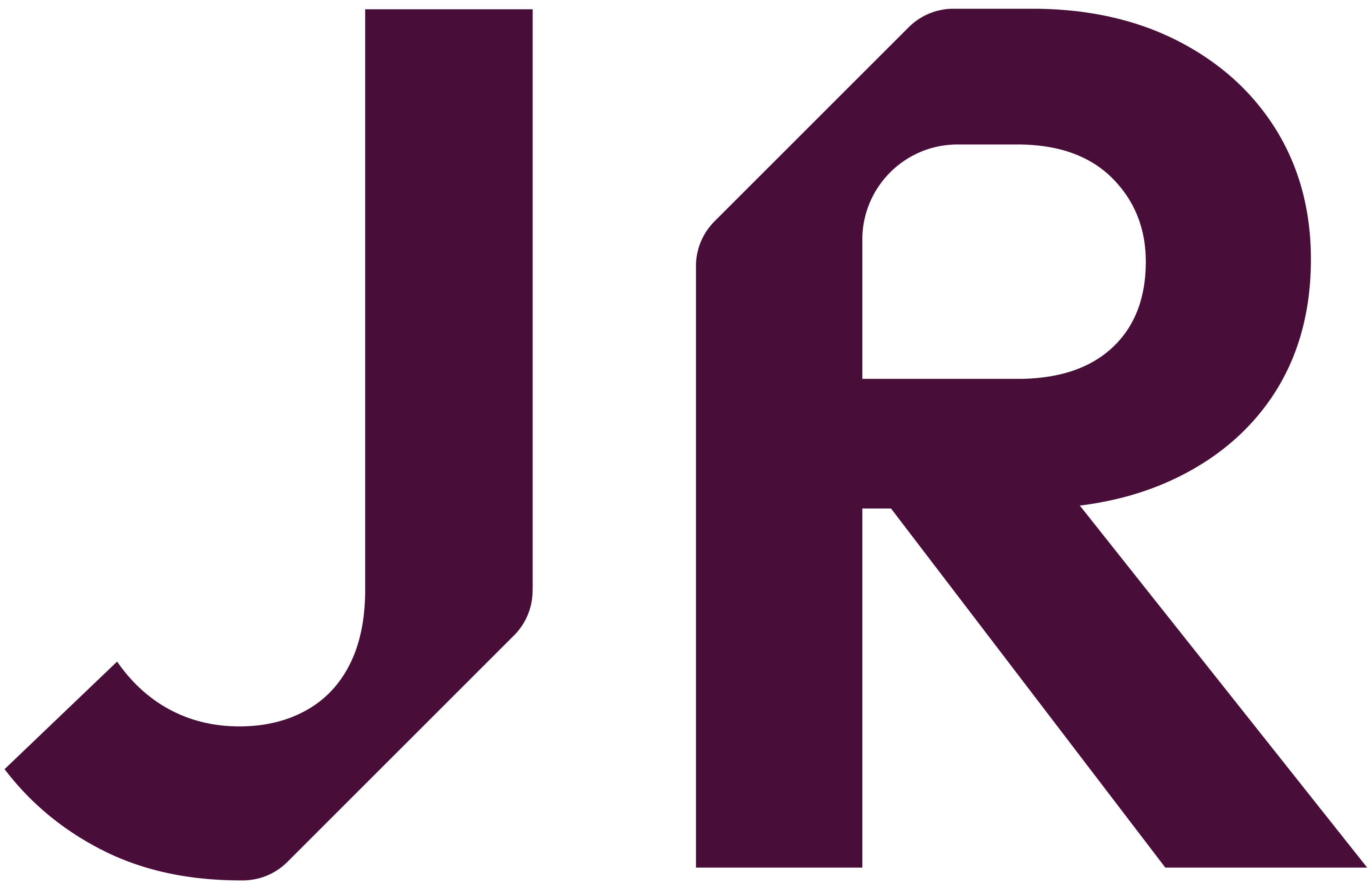
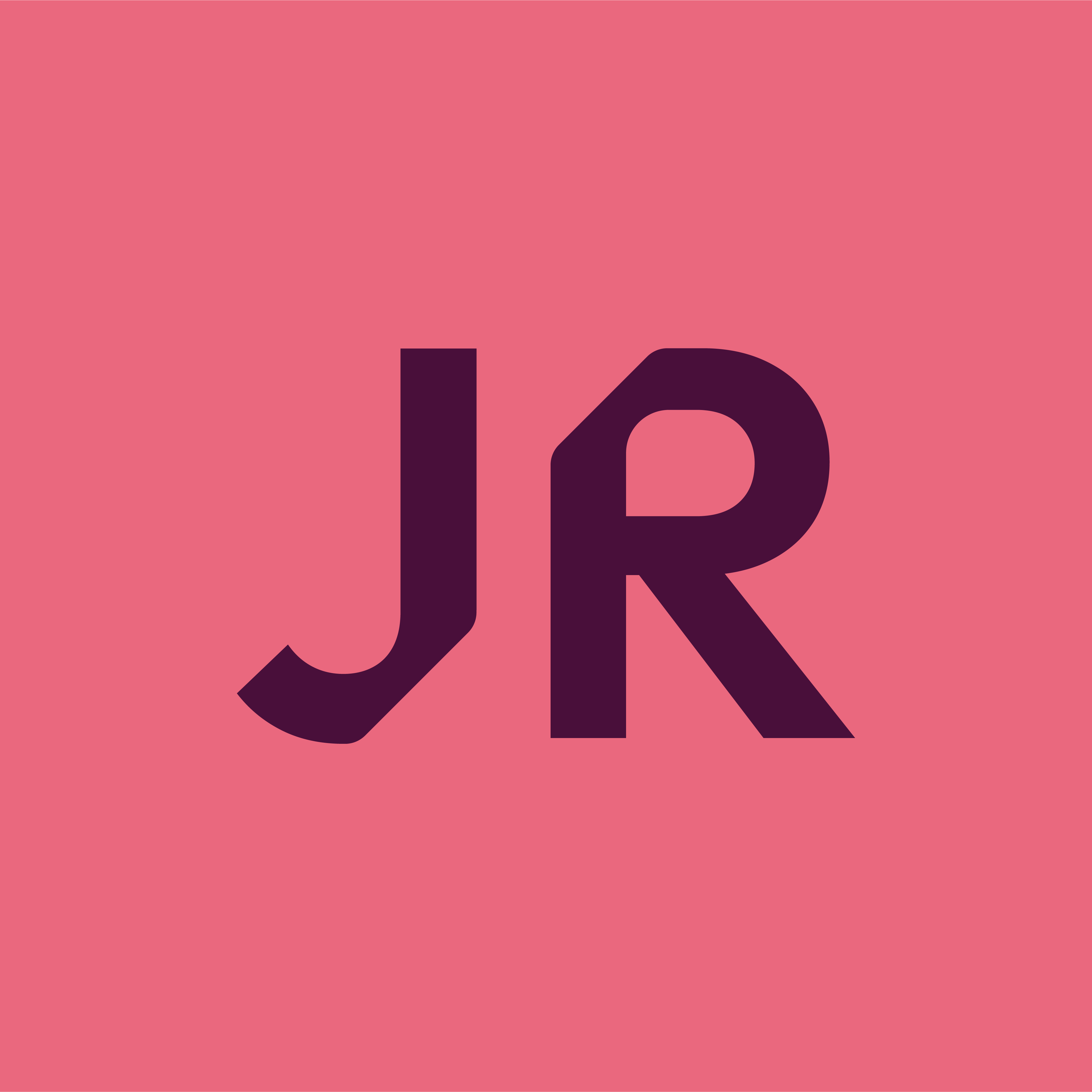
The primary wordmark should always be used at the first instance. Our logomark should be used when space is limited.
Occasionally, it may not be possible to use our primary wordmark when placed on different coloured backgrounds. The colours within the logo may clash with the backgrounds and cause accessibility issues. Our burgundy version may be used in this case to ensure enough contrast has been created.
Our secondary logomark should be used when space is limited and our primary logomark is causing accessibility issues.
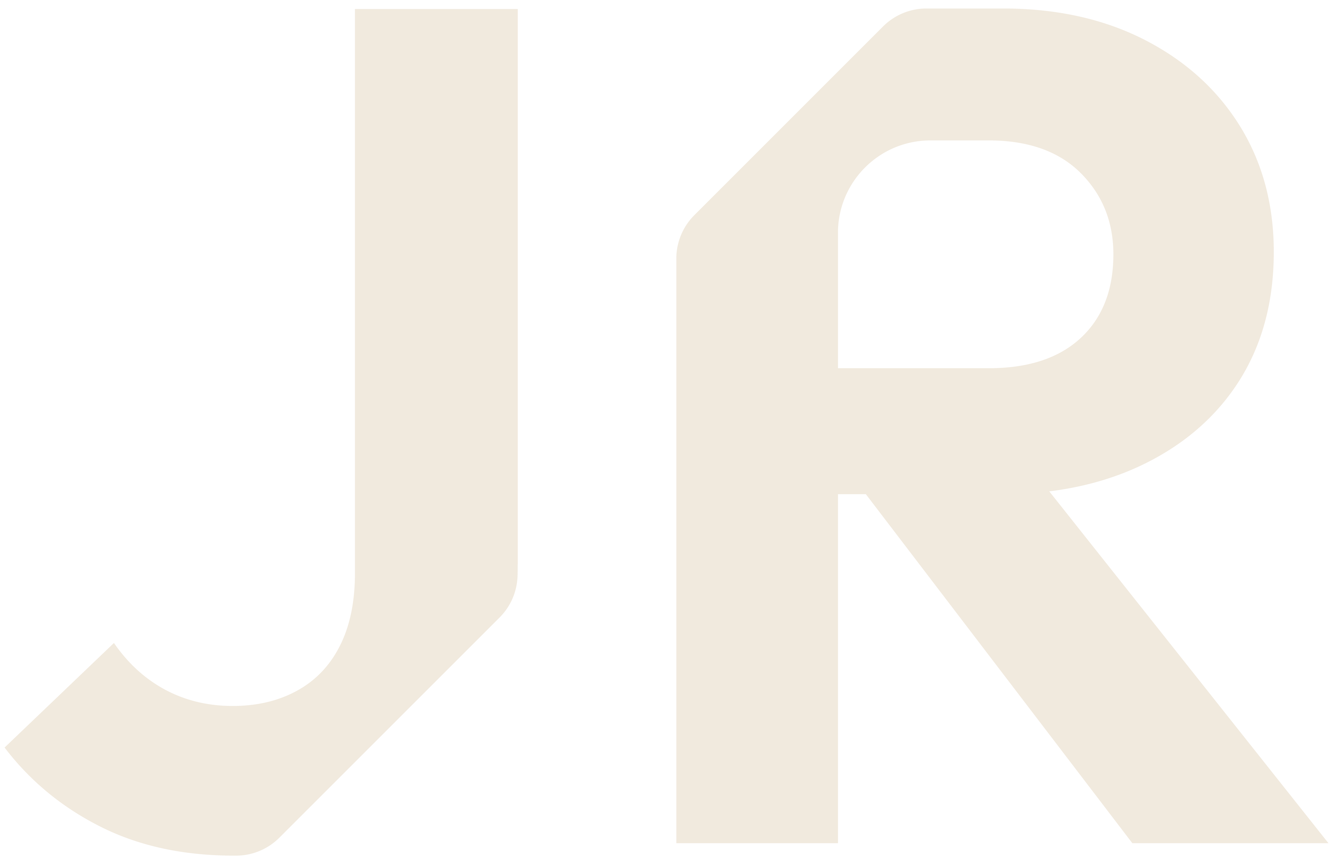
Versions with built in backgrounds can be used to ensure accessibility. The cream versions can be used on very dark backgrounds.


